
The Schuyler Quentel NKJV


The Quentel Reference Bible is the flagship edition from Schuyler, a relative newcomer to high-end Bible publishing that focuses on offering interior design and book blocks that rival the quality of their fine leather bindings. In my past coverage of 2014's Quentel NASB and last year's Quentel ESV, I have chronicled the establishment and fine-tuning of the format. Now Schuyler is releasing the Quentel in a new translation, the New King James Version, which means fans of the NKJV will now have to make a hard choice between this edition and the excellent Schuyler Single Column NKJV also featured on Bible Design Blog.
THE QUENTEL SERIES For readers new to the Quentel series, here's what you need to know: the Quentel uses a traditional double column page design by 2/K Denmark that locates cross references at the bottom of the page rather than between the columns, which is where you're used to seeing them. This choice allows the columns to be as wide as possible -- about 2.75" -- which they need to be, since the Quentel's Milo typeface is seen at a generous 11 pt. size. This makes these editions very easy on older eyes. The Quentel is now printed in the Netherlands by Jongbloed on 36 gsm PrimaBible paper (opacity rating: 83%), which also helps with readability without adding quite as much bulk as the original NASB edition's thicker pages. To make a long story short, the Quentel represents a very elegant culmination of classic Bible typography, printed and bound for a lifetime of use.

One of the things that makes the Quentel so easy to recommend, in addition to the nice paper and the large type, is the fact that it's now available in several different translations. There are a variety of good single column text settings these days, for example, yet I find myself recommending the Cambridge Clarion more than the rest because there's one for readers of the KJV, the ESV, the NASB, and the NKJV (and an NIV on the way, if I'm not mistaken). Now the Quentel series has enough breadth to fill a similar niche. If you're looking for a classic double column reference with generous type size and excellent quality, get a Quentel and you're set.
WHAT ABOUT THE HINGE? Another advantage of a growing range is that, as new runs are printed and new translations introduced, the Quentel format grows in refinement. As I've said in the past, these Bibles are boringly excellent when it comes to manufacture: Jongbloed's printing and binding is so consistently fine that you take it for granted, which is the way it should be. My one complaint in the past has been the stiffness of the hinges used to attach the book block to the floppy edge-lined cover. "We're working on it," has been the response, and when I reviewed the Schuyler Caxton NLT, there seemed to be definite improvements. How do the hinges on the new Quentel NKJV feel? Loose enough to make me forget that there had ever been an issue.

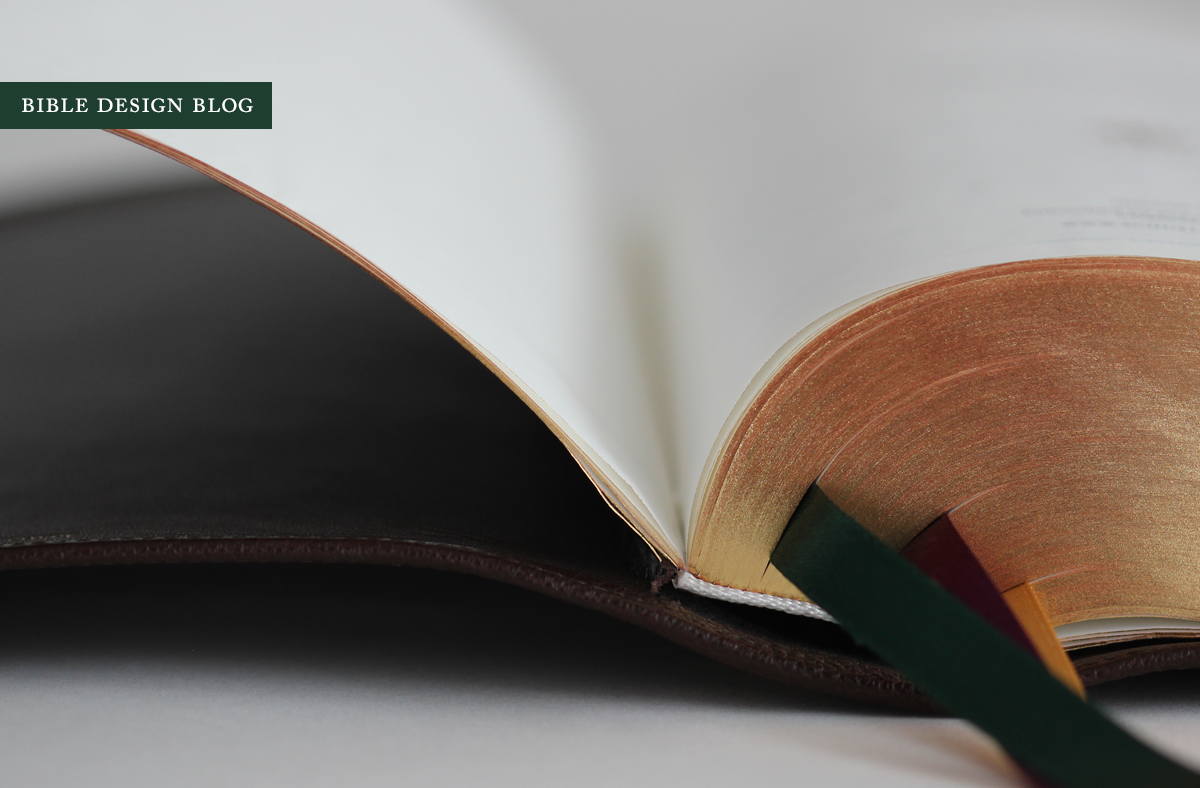
THE BINDING My review copy is bound in dark brown goatskin, leather-lined in matching brown. This is the ideal combination for someone who wants to forego the basic black route without making a statement. The art-gilt pages and the wide ribbons in green, purple, and gold don't exactly blend into the background, but the punch they add is subtle compared to the reaction you get with, say, a red or blue cover.
Like the other Quentel editions, this one features a limp cover stitched all around the edge for added strength. New to this edition, however, are the raised bands on the spine, reminiscent of the way Jongbloed styles the covers for Crossway's Heirloom Legacy. The imprinting on the spine is gold, and there is a blind stamped Jerusalem cross on front.


The imprinting is sharp, and I like the typeface. The scale of the stamped cross on front seems right in proportion to the cover's size. To my eye, the only thing that seems 'off' is the Schuyler logo at the bottom section of the spine, which looks a bit too large and wide to me. It's a minor point, but my preference is always to have a little breathing room on either side of the imprint.
Unlike paste-down bindings, which put boards under the leather, edge-lined covers like the Quentel's are prized for their liquid flexibility. A rigid cover keeps the book block in line, whereas a limp one sets the paper free. You can curl an edge-lined cover up and bend it back without leaving any tell-tale creases -- but that's not the point. The point is that a cover capable of such feats feels a certain way in the hand. It's slouchy and languid, the equivalent of curling up in your favorite chair instead of sitting ramrod straight at the table.


Whether you want a limp binding on a larger Bible like this is the question. People divide over this point. Some feel that when you're dealing with a bigger, thicker book block, it's nice to have some rigidity to the cover for support. If you're in that camp, edge-lined covers will drive you nuts. They're about as girdle-like as a stretchy t-shirt.
Consider this, however. A big Bible with a rigid cover is going to function a bit like a dictionary. It's great for the table-top, but awkward in the hand. With a flexible cover, you can fold back the side of the book you're not reading for a handier package overall. This is the technique we all used for super-thick mass market paperbacks, which is why all the fantasy and romance novels in the secondhand shops have unsightly creases down their spines. Here's a tip: you bend the cover, not the spine. This makes the book easier to hold without damaging the binding.

A SIZE COMPARISON The Quentel's cover dimensions are roughly 9.75" x 6.5", and it runs 1.75" thick at the spine. Not huge, but there's certainly some heft. The measurements are actually quite close to those of my original Crossway Legacy ESV, which was rebound for me by Leonard's Book Restoration back in 2013. The two books offer an interesting comparison since their outer dimensions are so similar while their interior layout is anything but. Let's take a look, because this will illustrate the different strengths of a traditional double column layout versus a more reader-oriented single column.
First, here are the two Bibles side-by-side. The Legacy in tan goatskin is on the left, and the Quentel in brown goatskin is on the right:
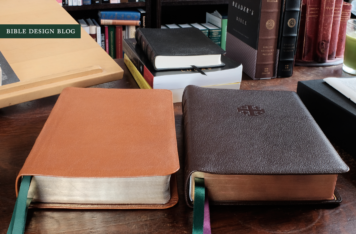
Thanks to the fact that the Quentel is available in both black-letter and red-letter editions (more about that below), I was able to create an interesting interior comparison. Schuyler sent me a loose signature from the red-letter edition, which I tucked into the Legacy for a neat side-by-side comparison of the two layouts:

The Quentel's double column layout means that a book with 11 pt. type and cross references can be the same size as text-only single column setting with 9 pt. type. True, the Legacy has some room in the margin that could be sacrificed for slightly larger type, but the fact remains, double column settings are more efficient when it comes to fitting words on the page, which makes for a thinner book block. While the Legacy's novel-like appearance makes for a more immersive reading experience, the Quentel might be more enjoyable for someone who struggles to scan smaller type.
RED-LETTER PITFALLS AND HOW TO AVOID THEM If you've read Bible Design Blog much, you know I'm not a fan of red-letter Bibles. The tradition of setting Christ's words in red doesn't go back as far as most people think, and risks giving the impression that some words on the page are more authoritative than others. But red-letter editions are as American as apple pie, and you wouldn't believe how many people, even knowing my thoughts, write in to ask, "Where can I find such-and-such an edition -- but with red letters?" For those of you I can't talk out of this not-so-traditional tradition, there is good news. The Quentel NKJV comes in both flavors, red-letter and black-letter.
The problem is, lots of red print can be a strain on the eyes, especially if the red verges into the realm of orange or pink, which can happen when the print impression is too light. If you're going to print a red-letter edition, the trick is go dark, trending more toward blood red than cherry. Schuyler has already mastered the skill by using red to accent chapter numbers and other matter, so it's not a surprise that they do red-letter right. All the red is shade darker than in past Quentels, which allows the red-letter words of Christ to be dark enough for the desired accent without calling too much attention to themselves. Since the chapter numbers and reference numbers are boldface, they appear darker than the red-letter text, which helps ease the dissonance of setting both Christ's words and some of the apparatus in the same color.


The only downside to the Quentel's 11 pt. type is that fewer words per line in a justified column will sometimes create too much space between individual words. In the spread above, you may notice a few instances. This problem, like the propensity toward one-word lines at the end of a paragraph, is built into double column design -- one of the trade-offs, you might say.
WRITING IN THE QUENTEL The fact that I have a loose signature means I was able to do something I usually wouldn't: test different writing tools on the actual page to see which ones perform best on the 36 gsm PrimaBible paper. I went through my desk and collected nine different instruments, a representative sample of the kinds of pencils and pens people tend to use when writing in their Bibles. Here's what I chose:

The Caran d'Ache Swiss Wood pencil (#1) leaves a medium-thick grayish line. The Lamy mechanical pencil (#2) has a thinner, darker impression, and it's a little sharper and less smooth on the page. The Lamy ballpoint (#3) is pretty typical of the dry-writing genre -- which isn't the worst choice for thin Bible paper, to be honest. The smaller Kaweco brass ballpoint (#4) performs similar to the pressurized Space Pen insert, which is what I used to use all the time for writing in Bibles. The Pigma Micron (#5), with its archival ink, is often touted as the "correct" choice by discriminating Scripture annotators. The Karas Kustom Render K (#6) takes Pilot H-Tec C inserts, which leave a nice, thin line. While fountain pens aren't recommended, I decided to give two of them a try: the Pilot Custom 74 (#7) features an Extra-Fine nib, and it's a Japanese EF, much finer than a European nib of the same rating, while the Yard-O-Led Grand Viceroy (#8) has a custom-ground italic/stub nib that started life as a Broad, so it lays down plenty of ink. (Tim Girdler did the grind, by the way. I'm not sure if he's still working on pens, but I love what he did with this one.) Last but not least, there's my trusty Tombow highlighter (#9).
First we'll examine at the front of the page, then flip it over to see the back. I went through Romans 8 and started underlining. The numbers in the margin correspond to the writing instruments listed above. Take a look:
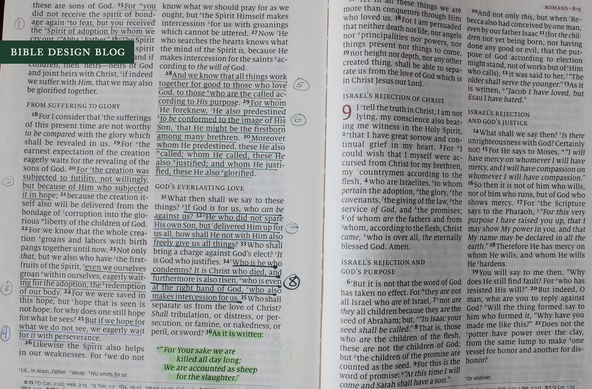
Both pencils did great. The lines don't jump out the way the ink does, but they don't damage the paper at all, and you can even erase them. If you're worried about writing in your Bible, pencil is the way to go. Both of the ballpoints worked, too. The humble ballpoint doesn't bleed through, just don't press too hard. The Pigma Micron and the Pilot H-Tec C stand out more than the ballpoints, and the Pigma Micron actually lays down a thicker line. For an eye-catching accent, either one would make a good choice. Both fountain pens ran into trouble. The EF nib looks fine on the front of the page, though. The B nib is just too juicy for the paper. You can see the ink pooling and feathering at the end of the lines. Wait till you see what the back of the page looks like! I expected the highlighter to bleed through, but it didn't.
Here's the reverse of the page:
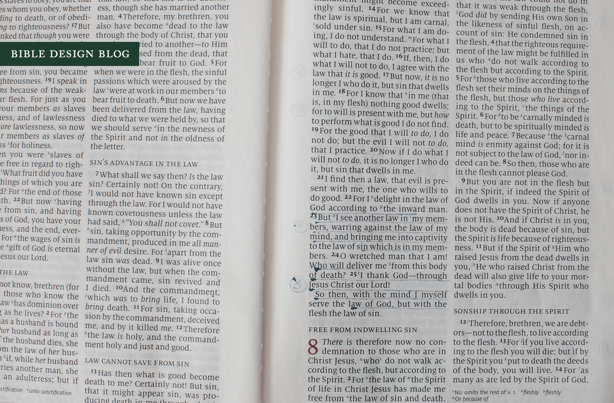
Let's distinguish between show-through and bleed-through. Show-through means you can see the impression of the writing on one side of the page when looking at the other. Bibles are notorious for show-through because of their thin paper, and the problem is more pronounced now compared to vintage India paper, whose rag content (apparently) allowed it to be thinner but more opaque. Bleed-through means the ink actually seeped through the paper. This is a common problem for wet inks like the kind used in fountain pens. The finish on many papers does not hold this kind of ink well. The page absorbs the ink, which gives the lines a feathery look, and in some cases the ink bleeds right through. Fountain pen users seek out paper with coatings that play well with wet ink, even though the drying time with such paper can be considerably longer.
The only pens that bled through the page were the two fountain pens, which isn't surprising. I expected the B nib to bleed through, but when I was underlining with the EF, the lines looked so sharp that I let myself hope. Alas, 36 gsm PrimaBible is about as fountain pen friendly as a Field Notes journal -- not so much. The good news is, with both the pencils there is no bleed-through and practically no show-through. The ballpoints have some show-through, but it's not too bad, similar to the amount of show- through the printed page itself manifests. The Pigma Micron and the Pilot H-Tec C show through more, I think, but that's probably because they are darker. This is Bible paper, folks, and hence fairly translucent. For me the most interesting result is the highlighter. Yes, it shows through, so there's a sickly green cast to the reverse of the page. But it's actually not terrible.
All this suggests that, if you want to write in your Bible, 36 gsm PrimaBible is a fairly accommodating paper. Unless you use pencil, you're going to see your annotations through the page. As long as you steer clear of fountain pens, though, everything will be fine. Your marked up Bible won't look pristine, but it won't look like a mess, either. It will have the lived-in, customized appearance of a working tool -- which is what it ought to be.
The Schuyler Quentel NKJV is available from EvangelicalBible.com in both black-letter and red-letter editions. The cover choices are dark brown, as pictured here, black, dark green, firebrick red, and imperial blue. The price is on the high end of the spectrum at $222, which is what happens when you combine fine quality and small print runs. The Quentel is a lifetime edition. If you want an elegant interpretation of the classic reference Bible design, that's what this edition is all about.

J. Mark Bertrand is a novelist and pastor whose writing on Bible design has helped spark a publishing revolution. Mark is the author of Rethinking Worldview: Learning to Think, Live, and Speak in This World (Crossway, 2007), as well as the novels Back on Murder, Pattern of Wounds, and Nothing to Hide—described as a “series worth getting attached to” (Christianity Today) by “a major crime fiction talent” (Weekly Standard) in the vein of Michael Connelly, Ian Rankin, and Henning Mankell.
Mark has a BA in English Literature from Union University, an MFA in Creative Writing from the University of Houston, and an M.Div. from Heidelberg Theological Seminary. Through his influential Bible Design Blog, Mark has championed a new generation of readable Bibles. He is a founding member of the steering committee of the Society of Bible Craftsmanship, and chairs the Society’s Award Committee. His work was featured in the November 2021 issue of FaithLife’s Bible Study Magazine.
Mark also serves on the board of Worldview Academy, where he has been a member of the faculty of theology since 2003. Since 2017, he has been an ordained teaching elder in the Presbyterian Church in America. He and his wife Laurie life in Sioux Falls, South Dakota.


