
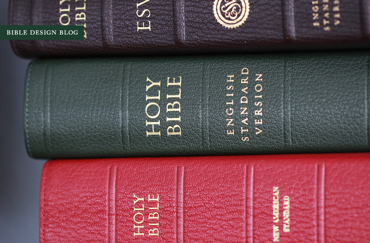
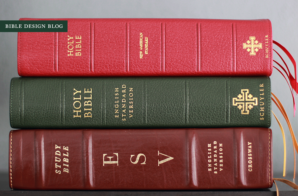
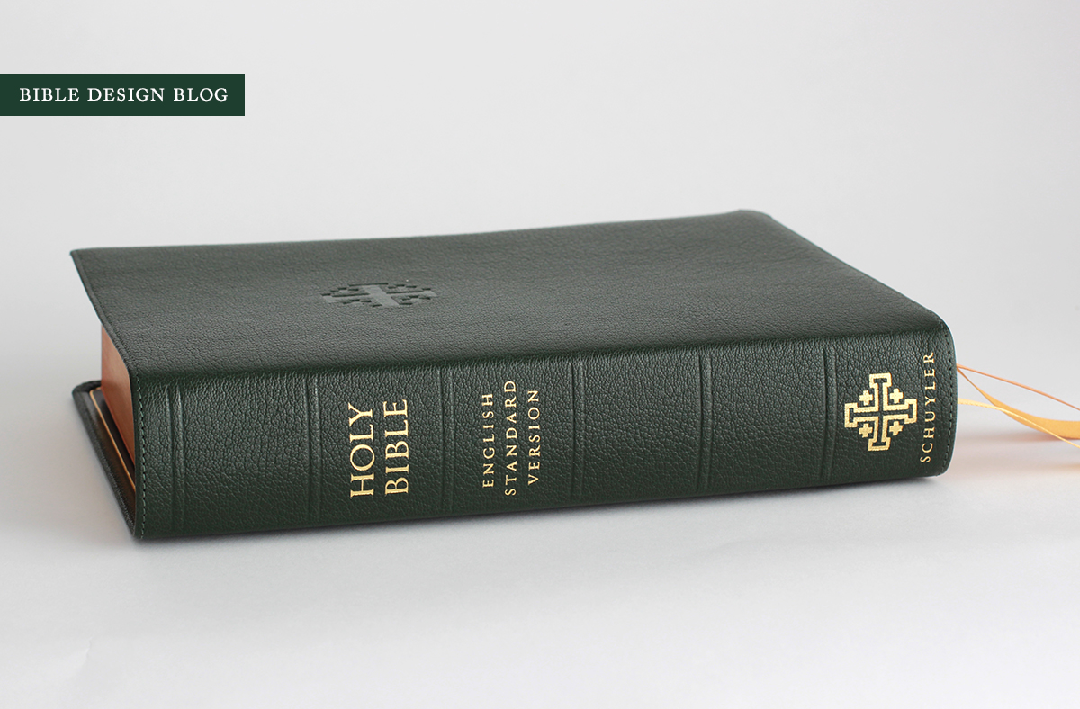
Schuyler ESV Quentel Reference Bible in Dark Green Goatskin
A new edition of the Schuyler Quentel has arrived, this time using the popular English Standard Version, and it's a notable release in several regards: there's the superb quality of the book, for one thing, not to mention the fact that this is the second installment in the Quentel range, which bodes well for the future of high-end reference editions in a variety of translations.
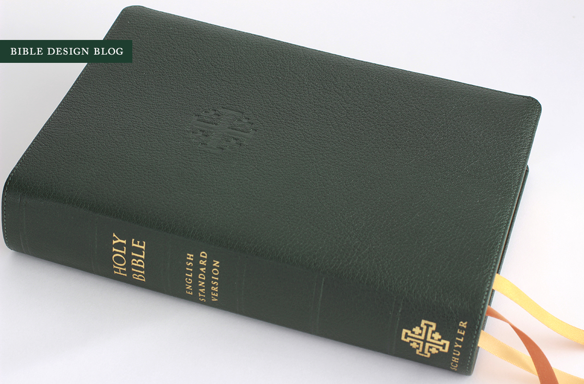
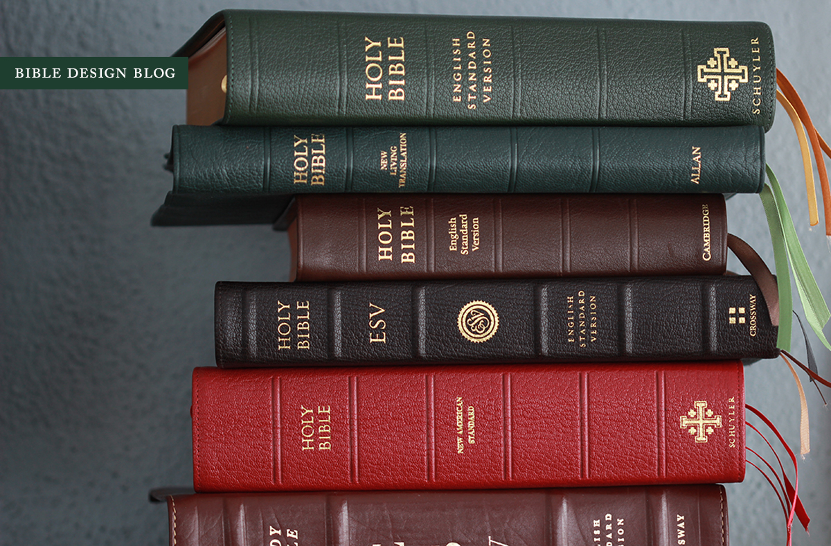
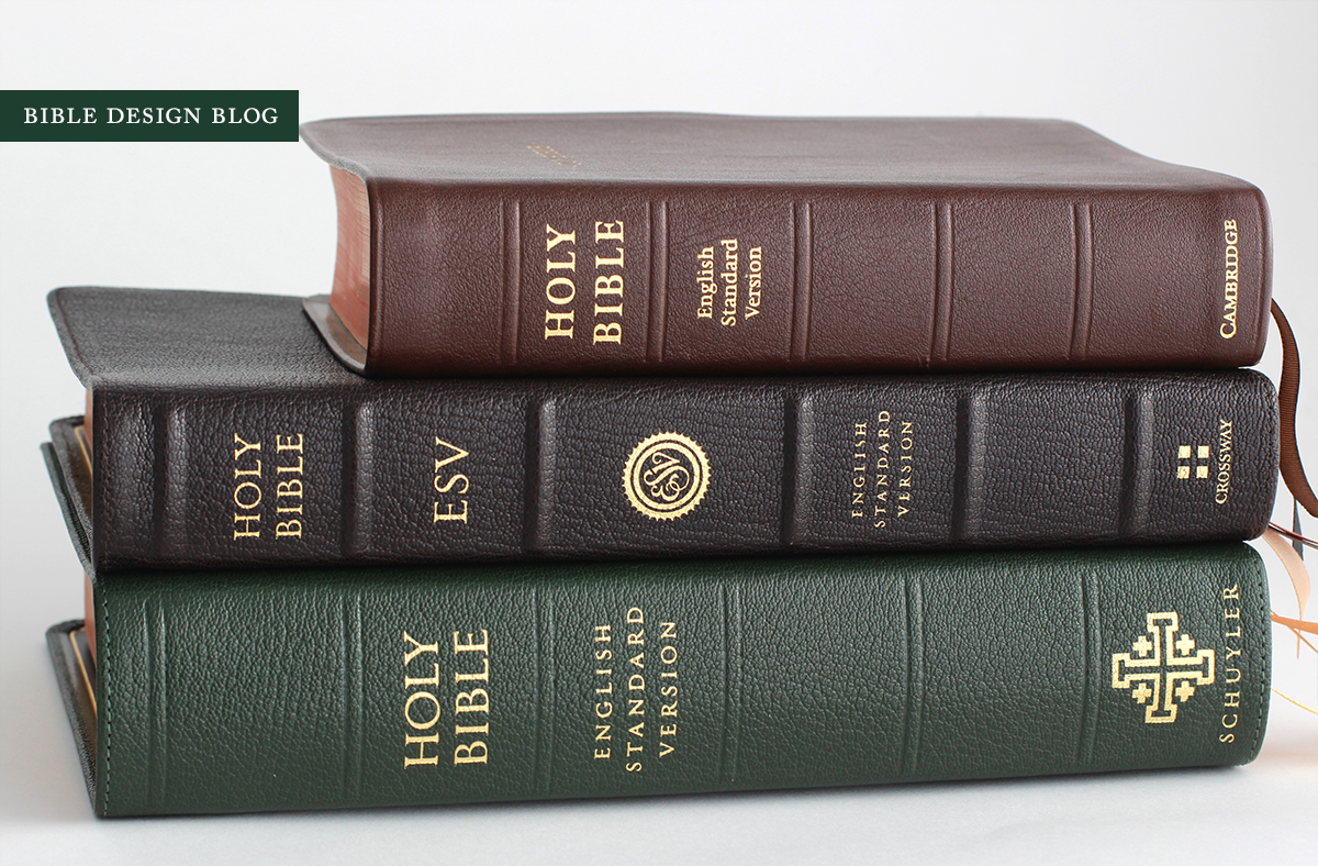
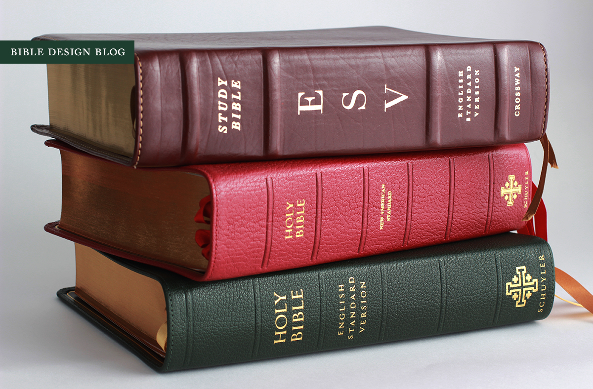
One reason I have relied on Cambridge editions like the Pitt Minion and Clarion as go-to recommendations over the years is that they are consistently fine Bibles available in a variety of major translations. They're an easy fit for a lot of people, since you don't have to switch translations to enjoy the format. The Schuyler Quentel is on its way to occupying a similar position as the new ESV Quentel joins the line-up. Now available in two major translations -- the ESV and NASB -- with the potential for more on the way, the Quentel has been designed from the ground up by 2K/Denmark as the ultimate double-column reference Bible, printed and bound in the Netherlands by Jongbloed, the same printer Cambridge uses.
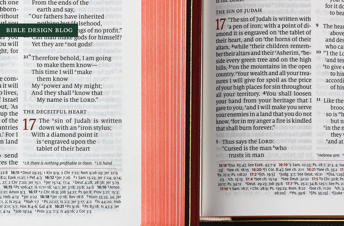
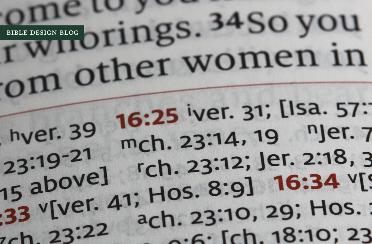
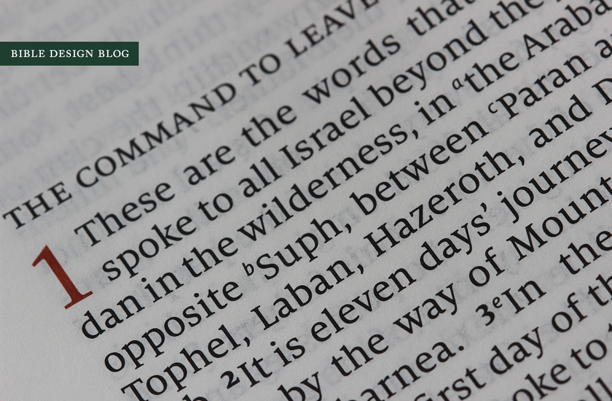
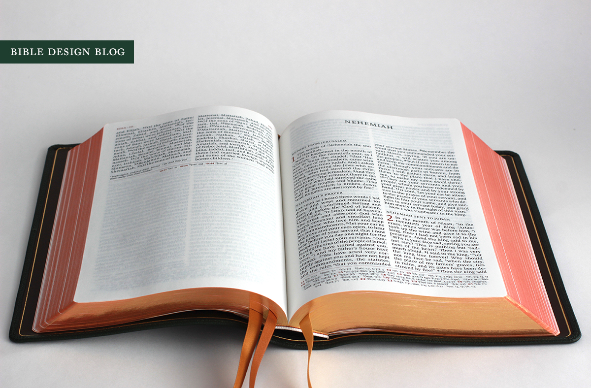
The Quentel is a big, thick book, comparable in size to a Study Bible, its girth the result of larger-than-average 11 pt. type and thicker-than-average paper. Striving for the right balance between thickness and portability, the 45 gsm Bolloré Primapage paper of the NASB Quentel has been abandoned in favor of 38 gsm Tervakovski Thinopaque, which has the same 84% opacity rating while allowing for a slightly thinner book. The ESV Quentel also features a slight evolution in the interior use of red ink for emphasis. In addition to red chapter numbers, the ESV Quentel uses red to set off the chapter and verse numbers in the cross references at the bottom of the page, giving them an extra pop without crossing into too-much-of-a-good-thing territory.
I've spent a few days with the new Quentel, including some time going back and forth between the original NASB and the ESV trying to decide whether the paper change has any negative impact. In terms of bulk, it's an improvement, in terms of opacity it seems to be a wash. So far, so good. I have not noticed any real difference, too tell the truth. The ESV looks every bit as good as the original in every category that matters, so the paper change strikes me as an unmitigated gain.
Another win, at least comparing my copies, is the spine. One of the negatives several readers pointed out about the NASB Quentel was the spine's tendency to bend inward rather than outward when the book was opened. This could result in a vertical crease down the spine. The good news is, the ESV Quentel's spine curves outward. I'm not sure if this is a consequence of the thinner book block or a change under the hood -- whatever the explanation, it's a welcome discovery.
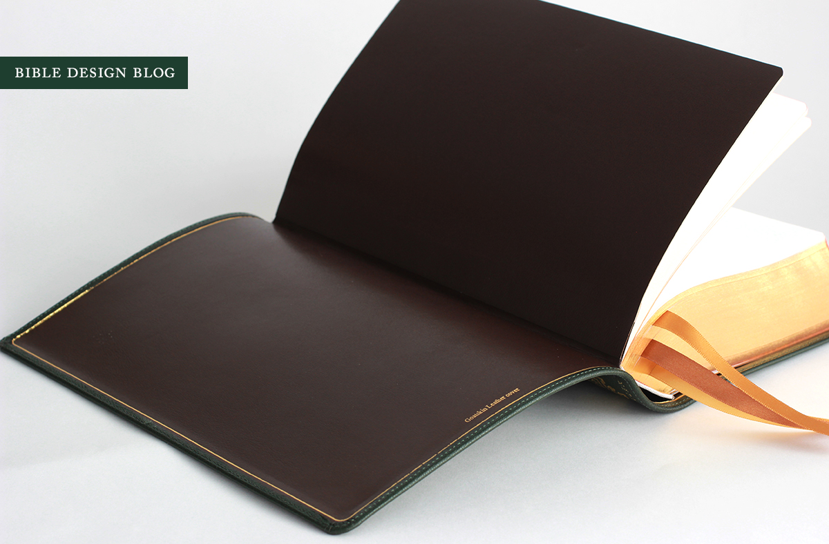
The ESV Quentel loses its predecessor's florid presentation papers, too, replacing them with a toned-down page more in keeping with the volume's aesthetic. This change sums up the ESV Quentel, really: the new edition represents a careful refinement of the old, acknowledging the successes (even taking it a step farther) while reconsidering the occasional miss.
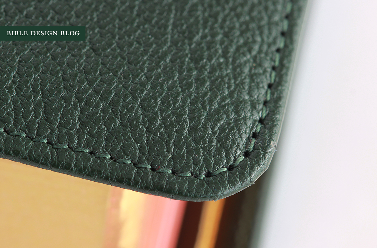
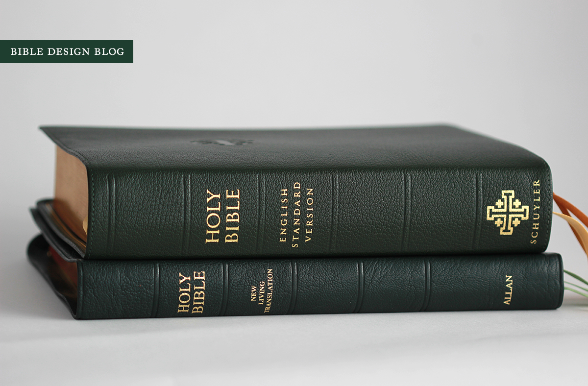
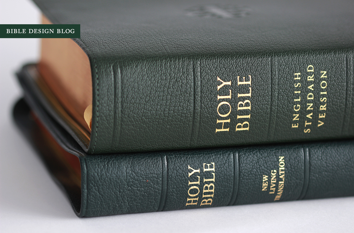
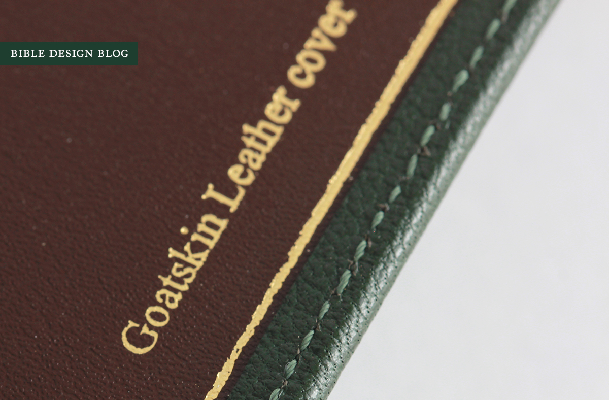
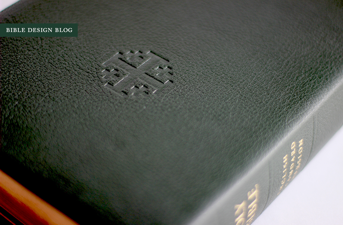
I came close to making a grave error when asked by Schuyler which color cover I wanted on my review copy. I'm a sucker for red, so I asked for that. Beth Rhodes, who handles customer service for EvangelicalBible.com in addition to co-moderating the Bible Design Blog Facebook fan page with the extraordinary John Blum, quietly cleared her throat and said, "Don't you mean the dark green?" (Well, this happened by e-mail, so the throat-clearing is metaphorical.) Beth was right, so very right. After falling in love with the dark green goatskin cover R. L. Allan bestowed on their recent NLT (reviewed here), my admiration for green bindings was rekindled. Now it's a burning flame.
Dark green inks have become a standard in my fountain pens. They are dark enough to look black on first glance, but more interesting than black on further examination. Sailor Epinard and Noodler's Zhivago are two of my favorites, though I've been using Noodler's Sequoia Green quite a bit over the last six months, as it strikes a pleasant balance between the two. Well, the same logic of second-looks applies in this case. If you want a cover that's out of the ordinary but will still pass as sober and austere from a distance, dark green fits the bill.
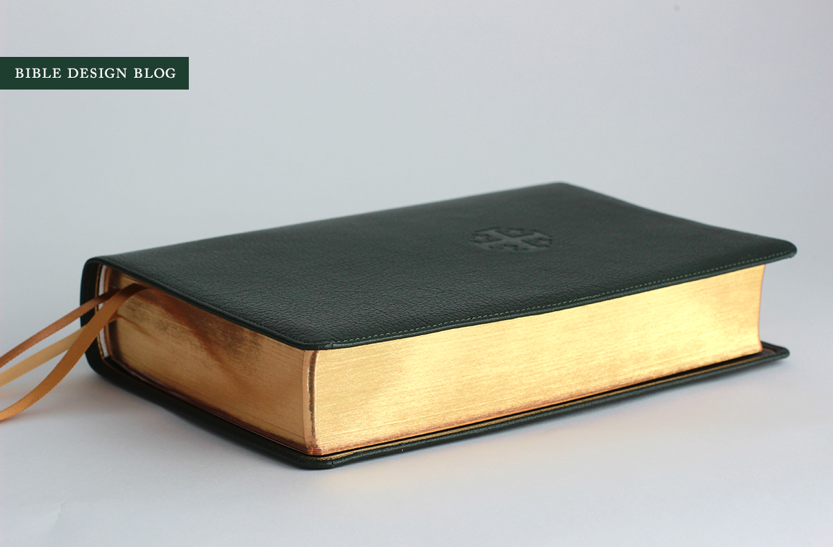
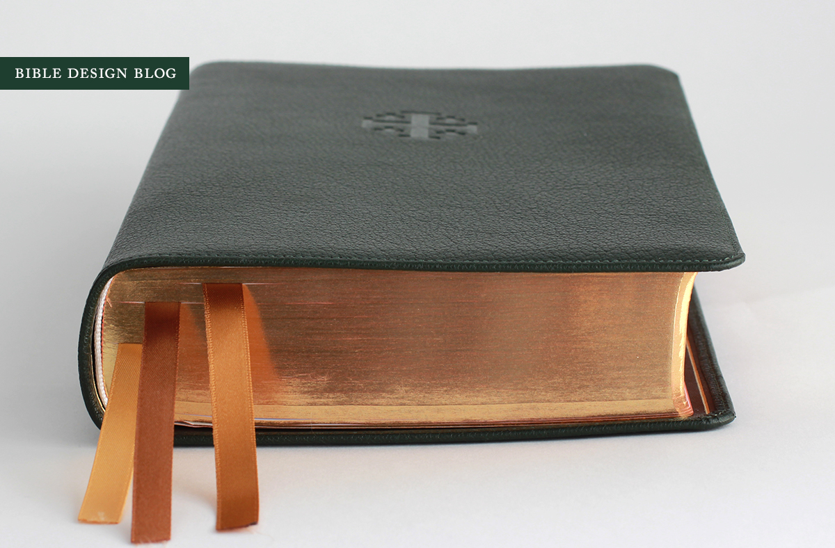
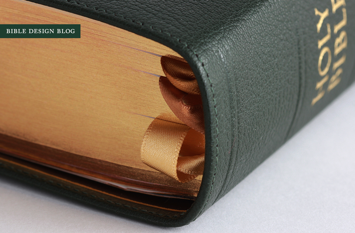
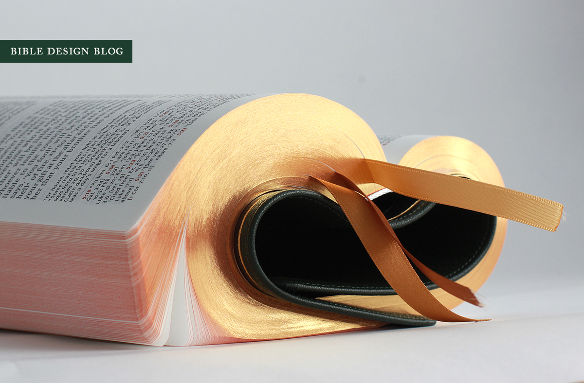
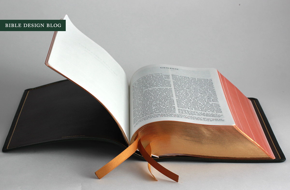
The art-gilt page edges complement the dark green nicely. Even more attractive: the three gold-tone ribbons which vary from light gold to yellow gold to rose-gold verging on copper-brown. This tasteful effect reminds me of one of those twisty rings of varicolored gold. I'm not as sold on the brown lining, though. The fact that it's not black is a plus, but ... it should have been green, don't you think? If we were talking brown cords with green tweed, I'd sing a different tune. We're talking leather, though. Luxuriant leather.
I don't believe in the future of Reference Bibles. The job they do is done better by digital tools, and as these tools gain ever wider acceptance I imagine Reference Bibles will see less use. Print editions won't need to pack all the extras inside the cover. People will turn to them for what they're best at: immersive reading sessions. Perhaps I'm wrong, though. We'll have to wait and see. In the meantime, you can't argue with the fact that, here and now, the demand for traditional Reference Bibles is strong as ever. With its ear tuned to demand, there's no surprise Schuyler's flagship Quentel fits the bill. However, the Quentel is not a business-as-usual reference edition. As I've noted before, by moving the cross-references to the bottom of the page and allowing more width for its twin text columns, the Quentel minimizes reading distractions.
Compared to, say, the Crossway Classic Reference ESV, the Quentel's layout is much more respectful to versified text, too. The slice-and-dice effect the Classic Ref's narrow columns administer to the Psalms is not in evidence here. No double-column layout can render poetry with the beauty of a single column, but the Quentel does its best. ("Who cares about beauty?" I hear some Philistine cry. Bear in mind that, in this case, elegant typography means distraction-free typography whose spacing doesn't suggest emphases in the text unintended by the translators.)

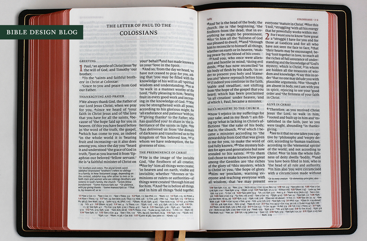
At the risk of sounding heretical, I'd also like to point out one downside to 11 pt. text in a double-column layout. Because these columns are right justified, and the larger type means fewer words per line, there are occasionally gaps between words in the paragraphed sections that are just too large not to call attention to themselves.
Unfortunately, there's one problem the new Quentel doesn't solve, and that's the dreaded "stiff hinge" that we've seen on a number of Jongbloed bindings, caused by using some sturdy, inflexible material to attach the book block to the cover. (I've written all about it in this review, so I won't repeat the details here. Suffice to say, the same observations apply.) This isn't a Schuyler problem any more than it's a Crossway one. It's something Jongbloed will have to address, and I hope they will. These limp, edge-lined covers were made to open flat, and it's a shame to pair them with binding materials that get in the way. Not all Jongbloed bindings have this issue -- my Cambridge Clarion, without an edge-lined binding, feels limper thanks to the absence of these stiff hinges. The rationale probably has to do with durability. That can be achieved without sacrificing open-flat performance, though.
The Quentel features a robust system of over 80,000 cross references, a vast (and frankly beautiful) concordance, and thirty-two pages worth of Oxford maps. These days I find myself using such features less and less thanks to digital tools. Just a few years ago, I could still justifying having them, though, for those moments out and about when the tools weren't close to hand. Smart phones have changed the game entirely -- and yet, the Quentel's reference features are so well executed that a bibliophile like me wants to use them on principle alone.


Schuyler is the publishing arm of EvangelicalBible.com, which is the exclusive source for Schuyler Bibles including the Quentel. If you'd like information on ordering one, follow this link. The Quentel runs $220, making it one of the most expensive retail editions you can purchase -- perhaps the most expensive. Off the top of my head, I can't think of anything priced higher. For your money, you're getting a very good Bible that's been thoughtfully designed and produced with a high concern for quality. You're also paying for the fact that top-tier editions like this are made in relatively small quantities that don't benefit as much as the big boys do from economies of scale. It's a significant investment. The ESV Quentel is a significant edition.
J. Mark Bertrand is a novelist and pastor whose writing on Bible design has helped spark a publishing revolution. Mark is the author of Rethinking Worldview: Learning to Think, Live, and Speak in This World (Crossway, 2007), as well as the novels Back on Murder, Pattern of Wounds, and Nothing to Hide—described as a “series worth getting attached to” (Christianity Today) by “a major crime fiction talent” (Weekly Standard) in the vein of Michael Connelly, Ian Rankin, and Henning Mankell.
Mark has a BA in English Literature from Union University, an MFA in Creative Writing from the University of Houston, and an M.Div. from Heidelberg Theological Seminary. Through his influential Bible Design Blog, Mark has championed a new generation of readable Bibles. He is a founding member of the steering committee of the Society of Bible Craftsmanship, and chairs the Society’s Award Committee. His work was featured in the November 2021 issue of FaithLife’s Bible Study Magazine.
Mark also serves on the board of Worldview Academy, where he has been a member of the faculty of theology since 2003. Since 2017, he has been an ordained teaching elder in the Presbyterian Church in America. He and his wife Laurie life in Sioux Falls, South Dakota.


