
The Incredible Shrinking Schuyler Quentel

The Personal Size Quentel NASB from Schuyler shrinks the original down to a handy form factor. The question is whether the Quentel layout, renowned for its large-print legibility, survives the transformation intact.
Over the past ten years, a revival of interest in quality editions of Scripture has altered this corner of the publishing landscape. Major publishers have re-introduced high spec editions of their better designs, while smaller concerns like R. L. Allan and Schuyler have flourished by focusing on fresh layout, good printing, and old school leather bindings. There has even been a resurgence of bookbinding shops. When I started Bible Design Blog, I knew of no independent bookbinders who could do the kind of limp, luxurious bindings that Allan was known for. Now we are relatively spoiled for choices.
The Neglected Compact Edition
The rising tide has not lifted every ship, though. A certain type of edition has received most of the attention: the sprawling, floppy, showstopper Bible. These seem to get bigger, thicker, and more packed year-by-year. Yet relatively little attention is paid to a genre dear to my own heart, the compact edition.
Maybe this is because the people with disposable income to afford these limited run editions tend to be old enough to have failing eyesight. Small print holds no attraction for them. The bigger, the better. Maybe it’s because so many of us, even those who cling tenaciously to printed books, are prone to rely on Bible apps rather than compact print editions when economy of carry is a factor. Whatever the reason, there are not as many finely designed and well made compact editions on the market as you might expect. I hope this will soon change.
Schuyler may be leading the way. Their latest release is the Personal Size Quentel NASB. Since 2014, the Quentel has been a popular reference edition thanks to the excellent design by 2K/Denmark and superb Jongbloed printing and binding. (Read my original post on the Quentel from 2014 here.) The generous type and crisp print impression combine to make the Quentel easy on aging eyes. While the original, thanks to its paper thickness, was a bit of a beast, Schuyler has brought down the bulk through successive editions by sourcing thinner, yet comparably opaque sheets. The Quentel has reached a sweet spot in its development … and now Schuyler has blasted it with the shrink ray.
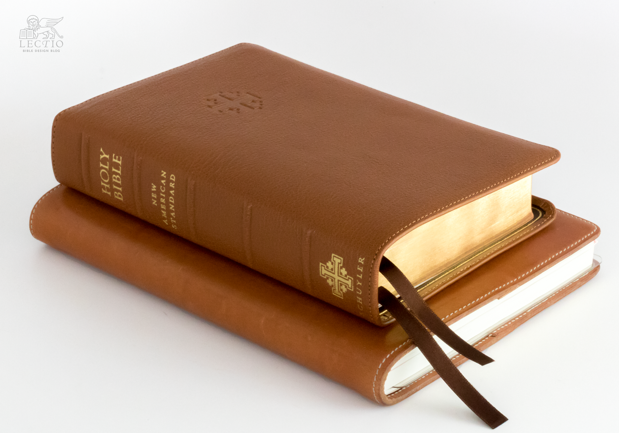
Above left: The new Personal Size Quentel with a Nanami Paper Seven Seas A5 Journal. Right: Inside, the same Quentel as before, only smaller.
I have always been fascinated by the idea of publishers making a single typeset layout available in different sizes. Cambridge, by using the same setting in both its Pitt Minion and Wide Margin editions, made flipping between the two a perfect delight. The passage you want is on the same page in both editions, on the same quadrant of the page as you remember. Of course, not every layout lends itself to such size manipulation. Looking good in large format is no guarantee that an edition will be equally attractive in minuscule.
Dwindled & Diminished?
When I heard that Schuyler was taking this path with the Quentel, the question in my mind was how a setting renowned for its legibility would fare when scaled down. People who adore the Quentel adore its size, or at least the advantages that size affords. They like how large the type looms, how easily a particular verse can be hunted down. Reducing the Quentel would mean reducing these virtues. Would the Quentel feel dwindled down, diminished?
The answer is no. In fact, as far as I’m concerned, the Personal Size Quentel is not just equal to the original. It is better.
The Personal Size Quentel (or PSQ, if you’ll allow the acronym) surpasses the original in every way but the obvious one, type size. The smaller Quentel is the one you will take and read, the one you will have with you, when its big sister is at home on the shelf. No, the type won’t jump off the page quite as boldly as before, but it remains crisp and readable. The enormous gain in portability compensates for everything. The PSQ feels fantastic in the hand, possessing all the trademarks of a luxury binding, while feeling quite practical and workmanlike in comparison. It is sized for use.
The specs from Schuyler are as follows:
- Available in Natural Grain Goatskin (leather lined) and Calfskin (paste off liner).
- Same Pagination as the Quentel Series – (page numbers and format identical)
- Approximate font size: 8.5
- 4.7″ x 7.0″ x 1.2″ (120 mm x 180 mm x 25 mm)
- Line Matching
- 28 GSM Indopaque paper
- 2 Ribbon Markers
- Art-Gilt edging (red under gold, blue under gold for Imperial Blue)
- 9mm yapp
- Smyth Sewn (as are all Schuyler Bibles)
- Black letter text (chapter numbers, headers and page number in red)
- More than 95,000 entry cross references
- Presentation page
- Lined note paper
- Extensive Schuyler Bible Maps
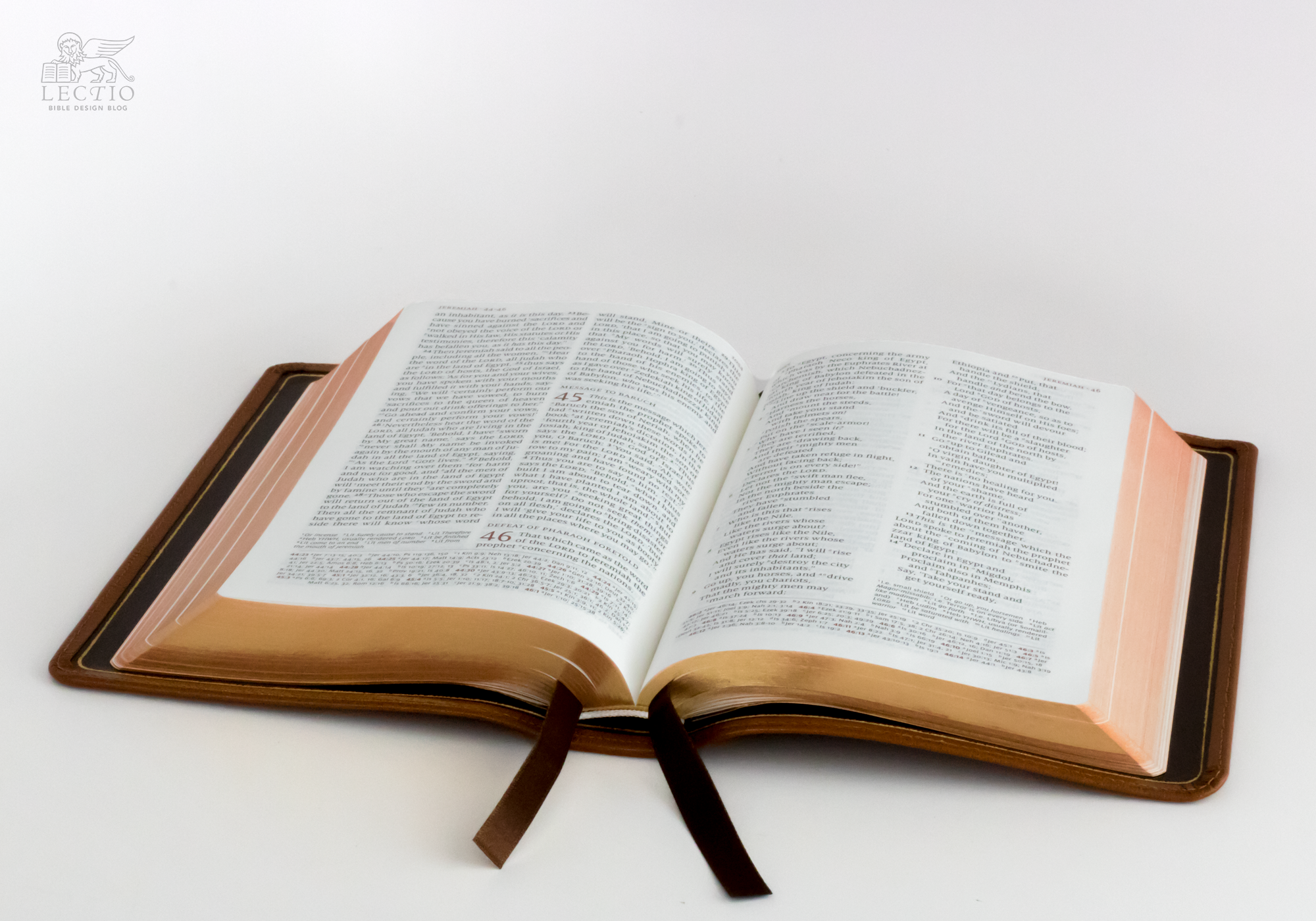
The size savings are made possible by reducing the size of the setting to roughly the size of a 5x7 trade paperback, while changing the paper to 28 gsm Indopaque, which has an opacity rating of 79%. An additional savings in thickness results from omitting the concordance found in the larger Quentel. The reduction of that already fine print proved impractical.
Smaller Is Better
My review copy is bound in British Tan Goatskin and retails for $185. The edge-lined cover has a semi-yapp edge, and is lined in dark brown calfskin. There are two brown ribbons. Compared to my trusty Cambridge Clarion, the PSQ is a bit taller and narrower, and perhaps a bit trimmer around the middle. It feels wonderful in the hand. The binding opens flat with that lazy edge-lined slouch, yet because of the smaller size, it never overwhelms your grip. Hold it open in one hand, and it doesn’t feel like it will slip away from you the way a larger edge-lined edition might.


Above left: The Crossway Heirloom Legacy is a thinline edition, but being shorter and narrower gives the Quentel a portability advantage. Right: The Cambridge Clarion is shorter, but wider.
In terms of readability, the Quentel is one of the best double column reference layouts. While it would not be my choice for deep reading, as a general use Bible, it is really excellent. The PSQ’s approximately 8.5 point type is obviously not as unmissable as the original’s 11 point type. Still, I had no difficulty tracking. Compared to other editions of comparable scale, the PSQ shines.
Reader, it pains me to confess that after years of scoffing at the trials of older people trying to read tiny print, my optometrist has written a prescription for progressive lenses. While I am still in denial — this feels like anything but progress — I have a newfound appreciation for enlarged type. So when I say that the Personal Size Quentel has not compromised its legibility by downsizing, these are not the words of a young whippersnapper who would not know the difference anyway.
The Perfect Companion
One question that interests me is whether Quentel readers will go back and forth between the original and the compact the way Cambridge Pitt Minion and Wide Margin readers have been able to do for some time. During my trial period, I never found myself needing to jump from the smaller to the larger. I imagine myself using a PSQ exclusively rather than in tandem with the original. (And I am looking forward with bated breath to the release of the PSQ ESV and other translations in the future.) Still, I have a feeling it might be different for some of you. If the Quentel is your go-to edition, but you would like to have a handier version for taking to church or out and about, I can see the Personal Size Quentel becoming the perfect companion.
J. Mark Bertrand is a novelist and pastor whose writing on Bible design has helped spark a publishing revolution. Mark is the author of Rethinking Worldview: Learning to Think, Live, and Speak in This World (Crossway, 2007), as well as the novels Back on Murder, Pattern of Wounds, and Nothing to Hide—described as a “series worth getting attached to” (Christianity Today) by “a major crime fiction talent” (Weekly Standard) in the vein of Michael Connelly, Ian Rankin, and Henning Mankell.
Mark has a BA in English Literature from Union University, an MFA in Creative Writing from the University of Houston, and an M.Div. from Heidelberg Theological Seminary. Through his influential Bible Design Blog, Mark has championed a new generation of readable Bibles. He is a founding member of the steering committee of the Society of Bible Craftsmanship, and chairs the Society’s Award Committee. His work was featured in the November 2021 issue of FaithLife’s Bible Study Magazine.
Mark also serves on the board of Worldview Academy, where he has been a member of the faculty of theology since 2003. Since 2017, he has been an ordained teaching elder in the Presbyterian Church in America. He and his wife Laurie life in Sioux Falls, South Dakota.


