
Reader-Friendly NLT: The Schuyler Caxton and the Tyndale Select Reference Edition
I am doing something today I don't think I've ever done before at Bible Design Blog: reviewing two editions side-by-side. But then, it's a unique situation. Two beautiful renderings of the same impressive design, both printed and bound by Jongbloed in the Netherlands.
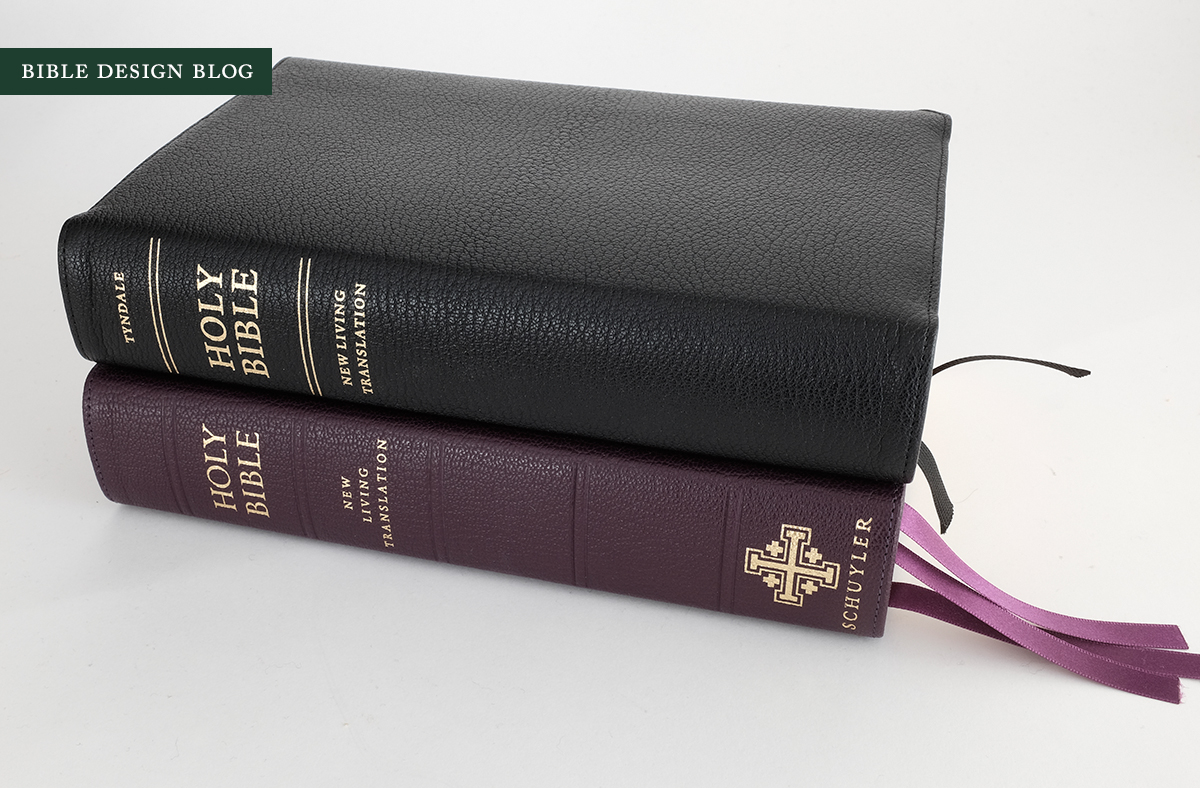
A TALE OF TWO EDITIONS Tyndale refers to this text setting as the NLT Select Reference Edition, while Schuyler offers it under the Caxton name. Both editions are printed and bound in the Netherlands by Jongbloed, and at first glance appear quite similar. The Caxton, however, features several grace notes that make it the more luxurious of the two — in particular the leather lining, upgraded ribbons, and wider range of cover colors. (As far as I can tell, the Select is printed on the same 28 gsm Indopaque paper as the Caxton.) If you prefer the Select’s more minimalist cover aesthetic, though, you can choose not only between black and brown, but also goatskin and calfskin covers.
For all the details on the Schuyler Caxton, visit the product page at EvangelicalBible.com. And for the scoop on the Tyndale Select, check out their beautiful web presentation.

For Schuyler, the Caxton represents both continuity and improvement. The consistent quality that has made Schuyler a market leader in the high-end Bible market is readily apparent here. In this sense, the Caxton is a ‘boring’ release — in the best possible way. You get exactly what you’ve come to expect from Schuyler’s line. At the same time, the leather lining marks a step forward for Schuyler, much nicer than the shiny synthetic liner in the Select’s cover (which is comparable to what we have seen in Cambridge editions from Jongbloed). More importantly, while this is not the first single-column setting from Schuyler, I believe it is the best.
The Select marks an even bigger advance for Tyndale, which dropped the former Select line (reviewed here) some time back. It’s great to see them returning to the high-quality market — and doing so in partnership with Jongbloed, too. Crossway entered this field awhile back, working with Jongbloed to bring us the excellent Heirloom line. Tyndale’s move ensures that readers of the NLT will enjoy Bibles of comparable design and quality.
THE TEXT SETTING Since both editions use the same text setting, let me cover the interior design first. In a nutshell, the Select/Caxton offers a reader-friendly reference edition in the spirit of Cambridge’s Clarion and Crossway’s Personal Reference. The similarities are striking, especially comparing the Clarion. The same typeface is used, Lexicon, which a lot of designers I’ve spoken with consider the ideal when it comes to Bible typography. The cross reference system looks similar, with boldface chapter and verse headings in the outer margin and references underneath. Textual notes are placed at the bottom of the text column.

Comparing the Select/Caxton to the Clarion, however, you notice some differences. The chapter headings are set in bold italics instead of the Clarion’s plain italics. The page header is in all-caps, like the Clarion, but the spacing between letters is looser, which gives a more elegant impression (and is in keeping with the generally whiter, more spacious page).
The biggest difference has to do with page proportions and the resulting impact on the proportions of the text column. The Clarion page measures 5” x 7”, a classic footprint for books intended for hand-held reading. On that page, the text column is 3.5” wide and 6” tall, which creates a wide, page-filling impression. The Select/Caxton, however, is a larger book. The type size has been bumped from 7.5 pt. to 8.75 pt, and so the page is enlarged to accommodate, measuring 5.25” x 8.25” — comparable in width to the Clarion but a full 1.25” taller. The taller page allows a taller text column: the Select/Caxton’s single text column is 3.625” wide and 7” tall. In other words, while it’s only 0.125” wider than the Clarion, the Select/Caxton’s column is a full 1” taller than the Clarion’s.

As a result, the Select/Caxton sits prettily between the Clarion and another beloved single-column text setting, the Crossway Legacy. I mean that literally. This text setting looks like the fruit of a conversation that went something like this: “What if we took the text setting of the Clarion and gave it the proportions of the Legacy, minus the huge margins?” The Heirloom Legacy, in case you’re wondering, has a text column that measures 4” wide and 6.5” tall.
Another significant difference has to do with the line spacing, what typographers call ‘leading’ since in the old days of metal type, spacing between lines was achieved by inserting plugs of lead. Making allowance for my middle-aged eyes, I estimate the leading of the Clarion to be about 9.5 pt., while the larger Legacy has roughly 11 pt. leading. When I apply my scale to the Select/Caxton, though, I get something along the lines of 11.5 pt., which gives each line a bit more air to breathe. This can aid both readability and your ability to keep your place on the page, since lines spaced more generously are harder for the eye to mix up.
To be honest, I find the difference in type size between the Clarion and the Select/Caxton fairly negligible. I knew from the stats which one was larger, and confirmed this by measuring, yet eyeballing the two side-by-side I can’t really tell much difference. That is not the case with the leading, however. The extra line-spacing has a curious effect. At times the Clarion’s type appears as large or larger to my eyes, but the Select/Caxton’s lines are easier to skim over. I am not sure which page I prefer, frankly, and I cannot guarantee you would experience the same effect. It goes to show how significant even the smallest changes can be to the way we process words on the page.

Comparing the Select/Caxton to another high-end NLT, the R. L. Allan NLT1 (reviewed here), illustrates two very different approaches to readability. The Allan features Tyndale’s Premium Slimline Reference book block, a two-column text setting that packs larger individual words onto a considerably larger page. Even setting aside the Select/Caxton’s superior paper quality, I would argue that the Select/Caxton, by virtue of its spacious one-column text setting is both more readable and more suitable to general use.

One last detail I want to point out is that, thanks to the New Living Translation’s more fluent use of dialogue tags, the translation benefits particularly well from a single column layout. As the passage below from Acts 22 illustrates, despite the slight anachronism that comes from retaining dialogue tags at the beginning of speech instead of in the middle or end of the line, which is much more common in English today, the NLT is formatted in a way that will scan smoothly for readers, with minimal confusion about who’s saying what. This isn’t always true in more literal translations, where retaining the antique grammatical form of the dialogue tags prevents new speakers from being indicated by the start of a new paragraph.

The print impression in both Bibles — at least, both of my review copies — was nice and dark, consistent from page to page. Line-matching seemed very consistent, too. Occasionally I found what appeared to be mis-matches, but in fact this was the result of other pages showing through underneath (a harder metric to control). Jongbloed did an excellent job with the printing on these editions.
THE SCHUYLER CAXTON Now that we’ve looked inside and considered what the Select and the Caxton have in common, I want to explore their differences more, which have mainly to do with the binding. My review copy of the Schuyler Caxton is bound in limp natural grain goatskin, in a shade of dark purple that I imagine resembles the shade of a Roman emperor’s toga. Byzantine emperors were said to have been “born to the purple,” and many quite literally were, their mothers having given birth in a palace chamber lined in porphyry.
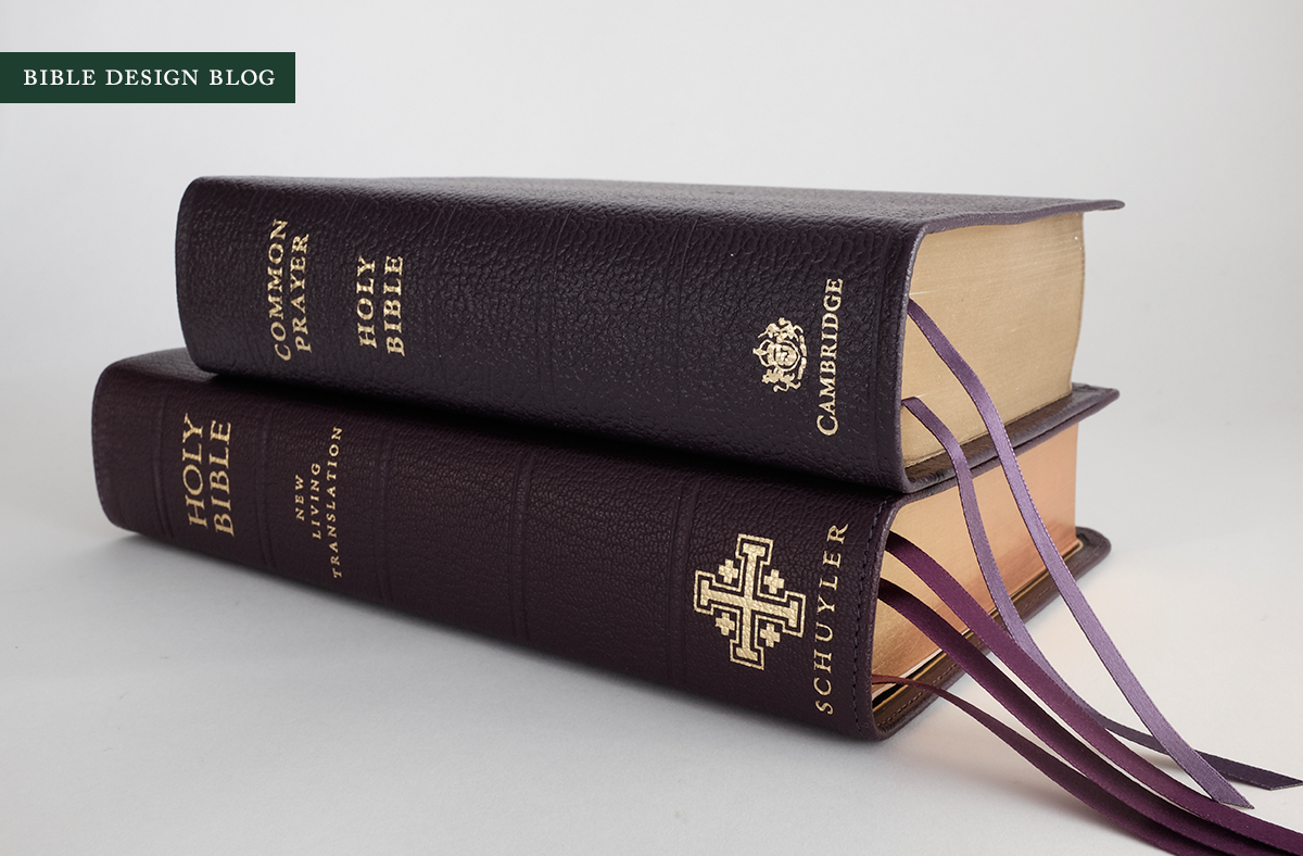
The color compares favorably with the Cambridge Prayer Book & Bible bound in purple calf split leather. Like the Cambridge, the Caxton’s lining is black, and you know how unhappy black liners inside a color cover make me. My objection to the practice is rooted in the fact that black has been the default option for so long. To me, a color cover with a black lining just screams that no one was paying attention to the details. Having said that, in this instance I happen to know for a fact that someone was paying attention to the details. Early in the process, the folks at Schuyler queried me about what color lining to use with a purple cover. The available options were limited, and as much as it pained me, black was indeed the most complementary of the choices. The others would have made for jarring combinations. All this to say, I’m not deducting points for the black lining in this instance — not that I keep track of points to begin with! — but I don’t want anyone to think I’ve made peace with the thought of black linings in non-black covers. I haven’t, and I never will.
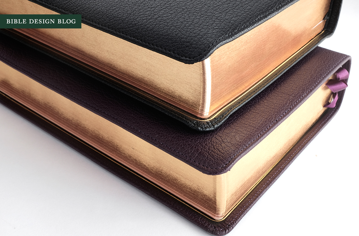
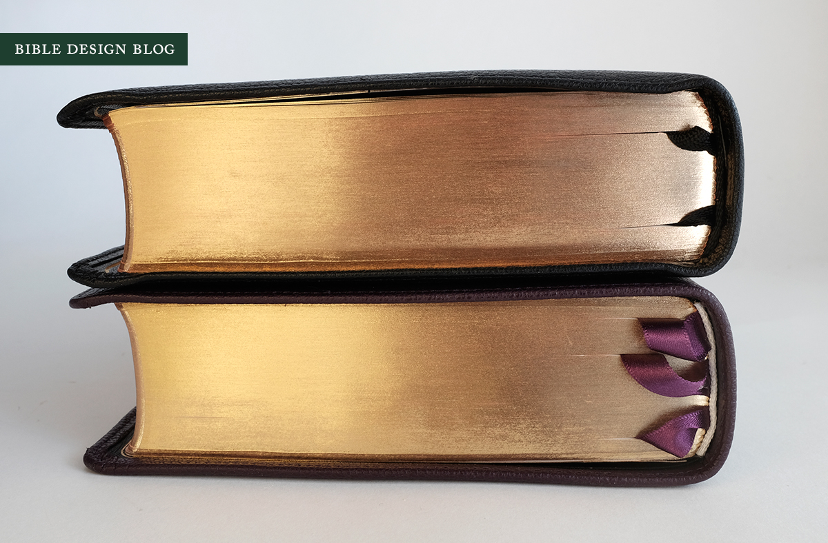
Whether my photos capture this or not, I must say that the purple cover and the purple ribbons make a painfully elegant combination. This is high church through and through. The red-under-gold page gilding and the gilt line around the inside cover are standard on Schuyler editions (also present on the Select), but something about the purple-on-purple combination elevates the look, each shade bringing out the richness of the other.

The bad news is, the purple Caxtons are all gone, sold out during the pre-order phase, and there won’t be more of them for months. Mourn if you want, but there are some beautiful color combinations available. Personally, I would suggest either the dark green or the antique marble brown. Or the blue. (Like I said, there are options.)
One tweak I would love to make to the Schuyler’s aesthetic is the scale of the printing on the book’s spine. It’s simply too large. The ‘HOLY BIBLE’ and ‘NEW LIVING TRANSLATION’ are borderline for me, but I would reduce them at least ten percent. This would make the spine less crowded and give a more refined impression.
The logo at the bottom could be reduced considerably more. Graphic designers often complain about the perennial client request to “make my logo bigger,” and for good reason. You want attention and you think the best way to get it is to yell. The design equivalent of a raised voice is the big logo. The reason designers buck is not just that oversized logos result in an unbalanced overall look; it’s because yelling doesn’t really have the effect the yeller thinks it does. Things that are balanced, in scale, in proportion, communicate a level of assurance that look-at-me enlargement never does. Over time, Schuyler’s cover decoration has grown more sophisticated. Bringing the elements into proportion on the spine should be the next big step.

Inside the cover, the story is all about the leather lining. While it may create a subtle improvement in feel, the gain I noticed most actually had to do with sound. One of the gripes I’ve heard from readers is that some high-end Bibles, when you handle them, make a squeaking sound. With the synthetic liner on the Select, I get a little bit of that — but I haven’t heard it once with the Caxton. Admittedly, comparing two individual copies falls short of a definitive test, but I’m going to tentatively agree with folks who’ve traced the sound back to the synthetic liners.
A NOTE ON THE HINGE The Jongbloed hinge has been a concern of mine for awhile, and the Caxton review copy was sent along with a note to the effect that, while the problem hadn’t been eliminated, the in-house team at Schuyler felt that the hinges on the Caxton weren’t as stiff as past editions have been, resulting in a Bible more apt to open flat. Imagine my disappointment when I opened my Caxton and found it would not lay flat. The good news is, the disappointment has abated. Let me explain.
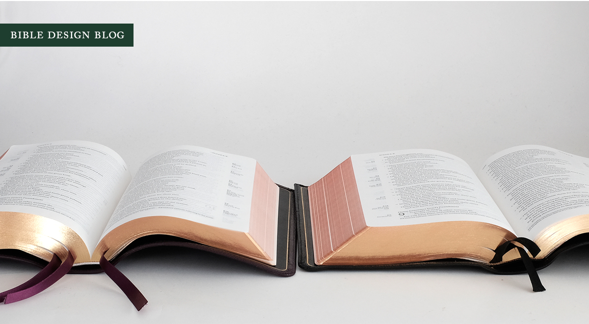
Out of the box, the Caxton did not feel any different to me than past Jongbloed Bibles, and I can confirm that the hinge is still there, and it is still stiff. What I found, however, was that with just a little bit of use, my Caxton was opening pretty much flat. Maybe the leather lining helped? Having two bindings of the same book block in hand presented a rare opportunity. I decided to see if the application of brute force would make the Select open flat the way the Caxton was. After bending the cover back and struggling with the hinge in ways I really wouldn’t recommend, I found that yes, the Select would open fairly flat, too. While these Jongbloed editions might not open as flat as, say, an Allan right out of the box, this seems to confirm that things get better with a bit of use.

Having said this, I should note that the new Heirloom Omega ESV, also printed and bound by Jongbloed, does open flat right out of the box — at least, my copy did. It, too, has a hinge, but a shallower one. I will be writing about this edition in the future.

THE TYNDALE SELECT The impressive thing about the Tyndale Select is how favorably it compares to the Caxton. “Of course it does,” you’re thinking. “It’s the same book block printed by the same printer and bound by the same binder.” True enough. But Jongbloed can do a wide range of work at a variety of quality levels. The work they do for Allan, for example, is higher spec than standard Jongbloed-printed Cambridge Bibles. And when a major publisher releases a luxe edition, the details do not always live up to the hype.
That isn’t the case here, however. Tyndale has created a beautiful website to promote the Select, and this Bible deserves it. This is a well-made, elegant edition suited to deep reading, teaching, and study, the kind of Bible you could settle down with for the long term. While I have only seen the black goatskin option, based on my experience of Crossway’s similar Heirloom line, I feel fairly confident in recommending both the goat and calf editions, based on your preference. The Select features an excellent text setting in a variety of fine cover options.
Everything I’ve said so far about the Caxton’s quality applies equally to the Select, with two exceptions. The liner is synthetic rather than leather, and the two ribbons you get with the Select aren’t nearly as nice as the Caxton’s three. These factors do make the Caxton the more usable of the two, if we’re thinking of lifetime Bibles here.

The Select might have one advantage, though. The aesthetic of the cover may be more to your taste. Stacking the printing at the top of the spine gives the cover a clean, modern look. While I prefer the classic feel of the Schuyler, my graphic designer wife gives the Select her thumbs up. I suppose the fact that the choice might come down to which spine you like the look of best illustrates how successful Tyndale’s return to the high-end market has turned out.
NEW LIFE FOR THE NLT I have turned to the New Living Translation for years as a back-up when working with more literal translations like the ESV, typically relying on an old hardback from the time of the original release. Despite my appreciation, I have never used the NLT as much as I might because the editions I’ve owned just aren’t designed the way I’d like. I thought that might change with the Allan NLT1, but despite my adoration for that big, floppy cover, I could never warm to the text setting itself.
Suddenly I find myself spoiled for choices: the Caxton in its beautiful array of colors, now with leather linings, and the Select in black and brown and the choice of goatskin or calf. The text setting, obviously, is what makes this Bible such an attractive option — but having it available in so many different color and binding options sure doesn’t hurt. NLT fans should be rejoicing about now. They’ve never had it so good.
Every translation with any kind of following deserves a reader-friendly reference edition like this, a single column setting with nice proportions that can serve today’s Bible reader as an all-around staple. There should be a NASB just like this, and an NIV and an NRSV. Insert whatever your favorite translation happens to be. If the NLT is your go-to, I can’t think of a single reason why you wouldn’t want a Caxton or a Select — or both — on your shelf. Not just on your shelf, either, but in your hands, and in the hands of your friends, your congregation, your Bible study partners. As far as the NLT goes, this is the text setting to have, and it’s available in a range of options that makes it simple to find the perfect edition for you.
J. Mark Bertrand is a novelist and pastor whose writing on Bible design has helped spark a publishing revolution. Mark is the author of Rethinking Worldview: Learning to Think, Live, and Speak in This World (Crossway, 2007), as well as the novels Back on Murder, Pattern of Wounds, and Nothing to Hide—described as a “series worth getting attached to” (Christianity Today) by “a major crime fiction talent” (Weekly Standard) in the vein of Michael Connelly, Ian Rankin, and Henning Mankell.
Mark has a BA in English Literature from Union University, an MFA in Creative Writing from the University of Houston, and an M.Div. from Heidelberg Theological Seminary. Through his influential Bible Design Blog, Mark has championed a new generation of readable Bibles. He is a founding member of the steering committee of the Society of Bible Craftsmanship, and chairs the Society’s Award Committee. His work was featured in the November 2021 issue of FaithLife’s Bible Study Magazine.
Mark also serves on the board of Worldview Academy, where he has been a member of the faculty of theology since 2003. Since 2017, he has been an ordained teaching elder in the Presbyterian Church in America. He and his wife Laurie life in Sioux Falls, South Dakota.


