
Bibliotheca, Mon Amour

When 2014’s Kickstarter sensation Bibliotheca finally delivered at the end of last year, I called its creator, Adam Lewis Greene. It was the first time we’d ever spoken apart from some e-mail exchanges during the campaign. Now it was time to tell Adam what I really thought.
The longer you have to wait, the more your expectations build. And the higher your expectations, the greater the risk of disappointment. The unexpected popularity of the Bibliotheca project on Kickstarter brought a whole genre of Bibles — the multi-volume, reader-friendly kind — out of the archive of past ideas. Before, the conventional wisdom had been that nobody wanted a beautifully designed and produced edition of Scripture separated into volumes so as to do away with the necessity for super-thin pages and super-small print. (Or at least, nobody wanted to pay for it.) When Bibliotheca raised nearly $1.5 million for exactly such an edition, the conventional wisdom was quickly revised.
And expectations were raised. Enormously.
Then the wait began. Bibliotheca missed its original delivery deadline. Time passed and suddenly it was the summer of 2015, a whole year had passed, and still no sign. The light revision of the American Standard Version that was originally envisioned gave way to a grander, more time-consuming update. Months ticked by. You could have been forgiven for wondering what had gone wrong, whether Bibliotheca would ever ship at all. At the beginning of 2016, I wrote a piece called “Why I Haven’t Given Up on Bibliotheca,” urging patience. I had no insider information. I’d never actually spoken with Adam Lewis Greene before. We had exchanged a few e-mails during the initial fundraiser and nothing since. All I knew was what everyone else knew. But I believed Adam was committed to producing a once-in-a-lifetime edition, and that he would eventually succeed.
It wasn’t until the end of last year that Bibliotheca began to ship. I received one of the earliest sets. Not long after it arrived, Adam and I spoke on the phone for the first time.
“You did it,” I said. “Everything about this is ... wonderful.”


Minimalist Purity
My expectations were not met. They were surpassed. Bibliotheca turned out even better than I expected. And Adam’s interest in typography proved to be much more than a hipster affection (as more than one cultural commentator had opined): the level of care taken in every aspect of the page design and typesetting was breathtaking to observe.
For example, the first thing I saw when I opened the first volume at random was an example of hanging punctuation, a quotation mark sitting just outside the edge of the column so as not to disturb the visual flow. It’s a gorgeous detail. As grace notes go, this one is easy to pull off, as simple as ticking a box in Adobe InDesign. Yet it is actually rather rare in contemporary Bible design. A punctuation mark at the beginning of a new line is typically set flush with the lines above and below, which results in slightly odd spacing. Okay, I admit: this is a minor detail. But Bibliotheca’s triumph is a victory of details.
Generally speaking, the goal of reader-friendly Bibles should be to replicate the immersive experience we typically associate with narrative literature. In place of the sliced-and-diced text of the traditional reference edition, reminiscent of a dictionary, a reader-friendly Bible resembles a history book or a novel. But such books come in a dizzying variety of styles themselves.
To understand the spirit of Bibliotheca’s design, you have to recognize first and foremost the kind of reader-friendly book it is. This is not a mass market paperback. Not a thriller off the bestseller list. Bibliotheca is designed like an art book. (Not surprisingly, it is also printed by a firm in Germany that prints art books.) Where one kind of design strives for populist accessibility, another aims for the kind of minimalist purity that exalts its content — or rather, signals that its content is meant to be exalted. The designer doesn’t presume to make it beautiful; rather, the designer recognizes its inherent beauty and designs accordingly. That’s what Bibliotheca does.

Lost in the Good Book
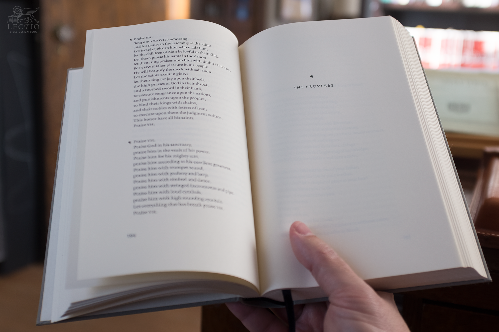
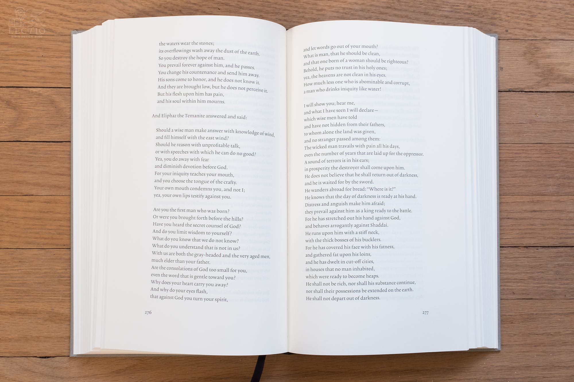
When you flip through a volume of Bibliotheca for the first time, you can’t help but feel that it goes too far. Too much has been removed. The cross references are gone, the verse numbers, but you expected as much. But there are no chapter numbers, either, no headings, no indication at the top of the page to orient you. There are words, just page after page of words. The only way to reckon your progress is counting down the page numbers.
I spend two months of the year on the road teaching at Worldview Academy, and this summer I brought a volume from Bibliotheca with me: The Latter Prophets, the second volume in the set, which is devoted to Old Testament prophetic writings beginning with the book of Isaiah. During some downtime between classes, I began to read, not intending to get very far. At a certain point I recall thinking, “I’m just going to keep going until I reach the end of the chapter.”
The thing is, there are no chapter breaks. So I kept going. I ended up reading pp. 15-40, landing me in Isaiah’s eleventh chapter. And it felt so painless.
Even though this has happened to me before with reader-friendly Bibles, it always surprises me. Honestly, a few chapter divisions and some unobtrusive superscript verse numbers do not seem that distracting. They’re nothing compared to an old Scofield Reference Bible, for example. It’s only when you find yourself in this deeply immersive design that you realize, slight as they are, these little extras do put distance between reader and text. Stripping them away allows the reader not just to approach nearer, but to enter into the text. You get lost in there. No, that’s not quite right. You don’t get lost. Rather, you lose track of the outside world. The critical distance between you and the text is reduced, but more importantly, the distance between your reading and everything else is greatly increased. You’re in here with the Bible, and the world is out there.


A Literary Translation
Bibliotheca’s revision to the American Standard Version was so extensive that, as I predicted, it has now been copyrighted as the American Literary Version. While I don’t comment much on translations at Bible Design Blog, I thought I might make some observations about the ALV.
There is something thrilling about reading familiar passages in a new translation. You feel as if you are gaining fresh insight. The same thing happens reading a familiar translation in a new format. The Authorized Version in a single column, paragraphed edition reads like a wholly different work than it does in an old-fashioned reference setting. (Really, it does.) By presenting an unfamiliar translation in an unfamiliar format, Bibliotheca delivers an experience that is especially revelatory.
A word I would never use to describe either this format or this translation, however, is accessible. The translation is literary, and occasionally archaic. In Isaiah 7.3 you read, “Go forth, pray, to meet Ahaz,” and might be forgiven for thinking God is instructing Isaiah to pray before the meeting. We don’t use pray to sweeten our requests anymore, except for the gossipy pray tell. Later in Isaiah 7, after Ahaz has refused to ask for a sign, we read: “Hear, pray, O house of David…” Again, the house of David is not being asked to do two things—to hear and to pray—but one. Hear, I pray thee.
In addition to archaic usage, the ALV sometimes orders words in a way that feels more poetic than natural. This is in large part a consequence of being a revision of the American Standard Version. These seem to be retentions rather than changes. But the choice not to update language is still a choice—an intentional one. Influenced by Robert Alter’s translation philosophy, the ALV shows a desire to maintain some of the distance between an ancient book and a modern reader. The aim is not, in other words, to render the rough-hewn polyglot lingua franca of the eastern Mediterranean into a contemporary equivalent. Success isn’t measured by convincing the reader the Bible might have been written sometime last week. The ‘difficulties’ a colloquial translator might shake his head over are in this case intentional, purposeful. Just as the page layout and the way the books are bound is intended to produce an impression, so is the text of the translation.
The fact that Bibliotheca used the ASV (now ALV) was always a matter of indifference to me. Personally, I would love to see every good translation available in a similar format. But for Adam Lewis Greene the translation was an essential part of the puzzle. Bibliotheca needed to be a certain kind of translation, just as the design and typography needed to follow a particular logic. After six months with Bibliotheca, I see the point. Both the design and the translation frame the ancient in a way similar to how a museum might, balancing accessibility with awe.

type design
As my original interviews with Adam Lewis Greene indicate, he designed the typefaces used in Bibliotheca himself. The text font is Katharos, from the Greek word for clean or pure, suggesting something that has been set apart. The title font, Katharos Archaic, is based on the text face, containing only capital letters and numbers. Based on hand-drawn forms and refined over the course of many revisions, the type resembles to my untutored eye the work of Eric Gill, one of Greene’s typographical influences.
Adam shared an observation with me that is worth passing along, because it illustrates how seriously he took the task of designing this edition from the ground up. A friend of his whose book had recently been published complained that the type, Eric Gill’s classic Perpetua, actually hurt his eyes during extended reading. How could Gill be such a master if his work caused headaches? Well, the sufferer was asking the right person. Adam explained that there is a problem with digital versions of Gill’s typefaces: they are based on the original letterforms rather than the actually printed pieces Gill oversaw.
“He designed Perpetua to be printed letterpress, not offset,” Adam explained. “The impression of letterpress printing causes the ink to ‘quash,’ which gives the letters a visibly more robust appearance, not to mention the added dimension caused by the impression. Gill always accounted for this phenomena in his designs.”

By not taking the printed specimens into account, the digital versions lacked the body they ought to have had. Katharos suffers from no such difficulty. Not only was the typeface designed specifically for Bibliotheca, but it was also designed with the intention of being printed at precisely this size, its downstrokes thickened to enhance legibility. (Technically, the type is set at 12 pt., roughly comparable in size to 12 pt. Perpetua.)
A number of charming flourishes were incorporated into the font as Adam tinkered with various iterations throughout the production process. I am particularly fond of the elegant ligatures, especially the way Katharos renders the combination ff, as seen in the photo above. Check out “depart from off them,” for example. As I noted earlier, this is a triumph built from small details.
In the end, the details add up.
A Thing of Beauty
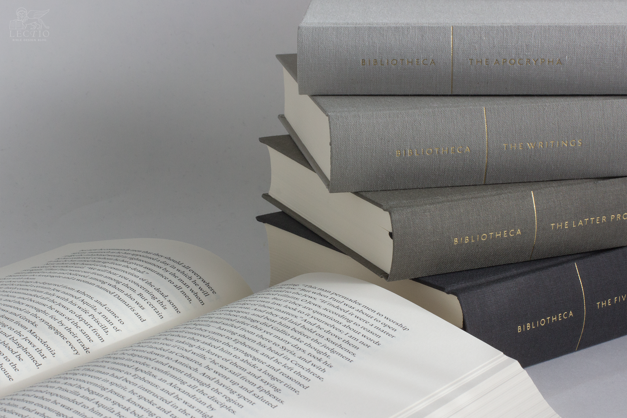
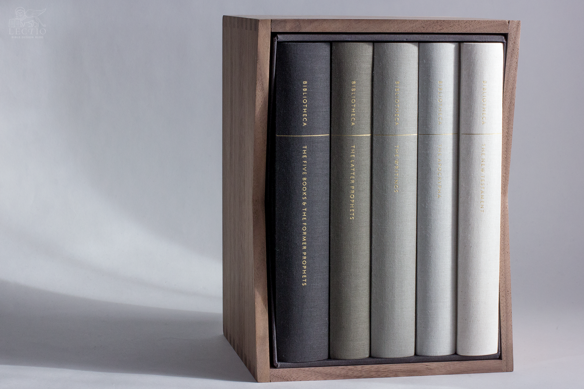
Bibliotheca consists of five volumes. Three contain the Old Testament, divided into The Five Books & The Former Prophets, The Latter Prophets, and The Writings. Where some reader-friendly editions take a conservative approach to the concept, leaving the traditional arrangement of Scripture untouched while optimizing its form for reading, others look for ways of making the arrangement itself more conducive. Bibliotheca is in the latter category. While the text is the same as the traditional Bible, the books are presented in the order of the Hebrew Tanakh, and in some cases—1-2 Samuel, 1-2 Kings, 1-2 Chronicles, Ezra-Nehemiah, for example—combined. Psalms 9-10 and 42-43 are combined, too, in deference to the belief that this reflects their original form. The fourth volume, The Apocrypha, contains the deuterocanonical books. The final volume is The New Testament.
The production details of each volume are impressive. As the specs sheet reads:
- Printed and bound in Germany by Kösel, est. 1593
- Smythe sewn, lay-flat binding
- Smooth, opaque paper is wood-free, acid-free, and stone-based; made in Austria without the use of bleach
- Unbleached, 100% cotton book cloth, dyed specially for this edition; made in the Netherlands
- 100% cotton satin weave ribbon marker; made in France
- 100% cotton head & tail bands; made in the U.K.
Kösel has done an amazing job on these books. They open flat, feel good to the touch, and exude the quiet beauty of a well made volume. The true test is handing one of these books to a bibliophile without any prior knowledge of Bibliotheca. In my experience, the reaction is always positive. If your bibliophile also happens to be a Bible reader, prepare yourself to witness spontaneous euphoria.
The five hardcover volumes are bound in book cloth on a spectrum of shades from dark charcoal to white, the minimalist titles standing out in gold gilt. Add the walnut slipcase and you have a beautiful, restrained object well suited to modern taste. It looks good on the shelf in your study, or for that matter in your living room. It was made both for reading and for display. That last consideration is hardly frivolous. Scripture deserves such a dignified treatment, and surely it ought to be so visible.


If you visit the Bibliotheca store, you can purchase the complete set in hardcover ($199) or paperback ($159), with or without the solid walnut slipcase ($119). You can also buy the complete Old Testament ($149), or just the New Testament volume ($59), although at time of print this option was sold out. The sets are also available on Amazon with Prime shipping.
I was an early backer of the project on Kickstarter. Now that it has arrived, do I think the cost and wait was worth it? Absolutely. Bibliotheca is a labor of love, obsessively beautiful, lavishly minimalist, every detail pondered yet rendered with such breathtaking simplicity that something very difficult has been made to look easy. To me it’s a piece of publishing history, too. The event that may just have turned the tide in favor of reader-friendly editions of the Bible.
J. Mark Bertrand is a novelist and pastor whose writing on Bible design has helped spark a publishing revolution. Mark is the author of Rethinking Worldview: Learning to Think, Live, and Speak in This World (Crossway, 2007), as well as the novels Back on Murder, Pattern of Wounds, and Nothing to Hide—described as a “series worth getting attached to” (Christianity Today) by “a major crime fiction talent” (Weekly Standard) in the vein of Michael Connelly, Ian Rankin, and Henning Mankell.
Mark has a BA in English Literature from Union University, an MFA in Creative Writing from the University of Houston, and an M.Div. from Heidelberg Theological Seminary. Through his influential Bible Design Blog, Mark has championed a new generation of readable Bibles. He is a founding member of the steering committee of the Society of Bible Craftsmanship, and chairs the Society’s Award Committee. His work was featured in the November 2021 issue of FaithLife’s Bible Study Magazine.
Mark also serves on the board of Worldview Academy, where he has been a member of the faculty of theology since 2003. Since 2017, he has been an ordained teaching elder in the Presbyterian Church in America. He and his wife Laurie life in Sioux Falls, South Dakota.