Crossway ESV Pocket New Testament in Black Genuine Leather and Coffee TruTone
 OVERVIEW
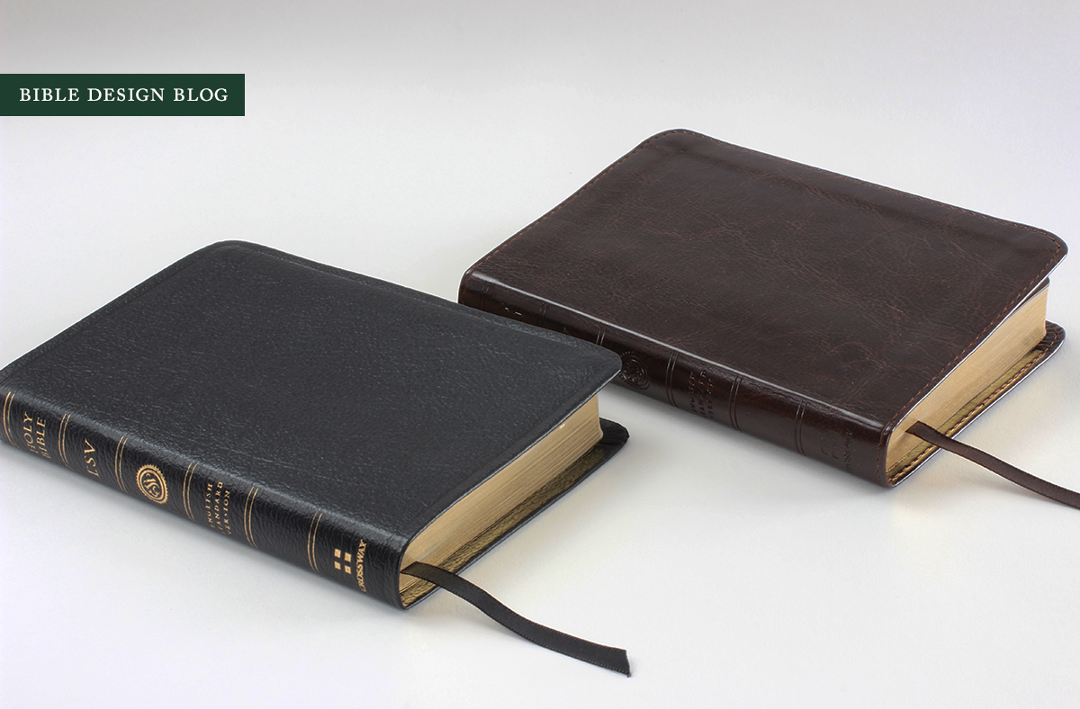
It doesn't open flat. It's printed and bound in China. The best binding option available is genuine leather. Three strikes and you're out? Not in this case. What the new ESV Pocket New Testament does well, it does very well -- enough to overwhelm my usual objections. In fact, since the box arrived from Crossway, the genuine leather edition has been my daily companion, displacing much nicer Bibles thanks to its pocketable size and readable layout. The street price on these New Testaments starts at about $15. At that price, it's a no-brainer. The ESV Pocket New Testament is a great little Bible that proves how nice a small-format single-column text setting can be.
DESIGN NOTES & PAPER
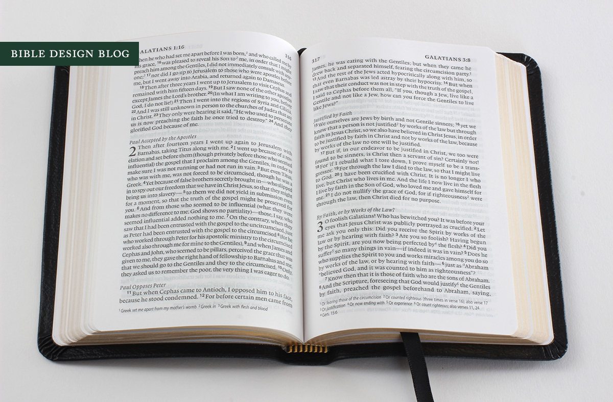
The deal breaker for some of you will be the 7 pt. type, but in a volume this small, it's essential. My cool tortoiseshell glasses aren't for show; I'm blind without them. Yet I can read this type without much difficulty. The important thing for me is the form factor: approximately 4" x 5.5" closed, and 8" x 5.5" open in your hands. It's a comfortable size to hold for a long period of reading.
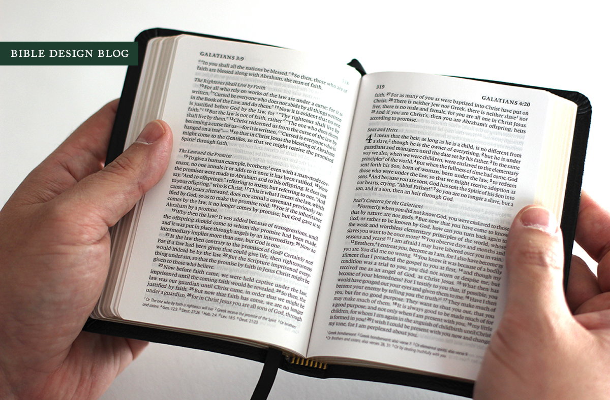
The paper helps in this regard. After I posted my review of the Schuyler Quentel NASB, including a comparison of paper opacity, I've received a lot of feedback to the effect that maybe 36 gsm paper used in the Crossway Legacy represents a sweet spot in balancing opacity and thickness. The Legacy uses 36 gsm (24#) ThinCoat Plus, 1375 ppi. When I saw the Pocket New Testament, I thought: "It's like the Legacy!" I was off, but not by much. The Pocket New Testament's paper is Apple Thin Opaque, 36 gsm, 1270 ppi. It's not the same paper used in the Legacy, but it's in the ballpark, and it shows.
As you can see in the photos, there is show-through but it's not obnoxious. The whiteness of the paper, the spot on line-matching, the consistent imprint, and the paper's relative opacity come together for a pleasant reading experience. I am impressed.
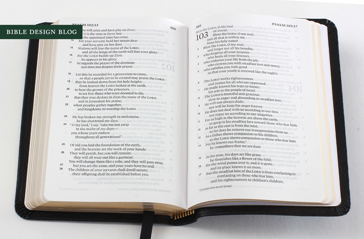
As you can see above, the poetry really shines in this little single column setting. Try reading a psalm in your large format double column Bible, then switch to the same passage here. See the difference?
The Pocket New Testament, like the new Wide Margin Reference, is a red-letter edition. I won't bore you with another repetition of why I dislike this Victorian innovation -- suffice it to say, this is what the American Bible consumer expects, and when confronted by a more traditional black-letter edition, suspicions of disrespect arise. At least the Pocket New Testament -- again, like the Wide Margin Reference -- uses relatively dark red ink. This makes the words of Christ a little harder to read than if they were printed in black, but not nearly as challenging as the pink or orange-toned reds.
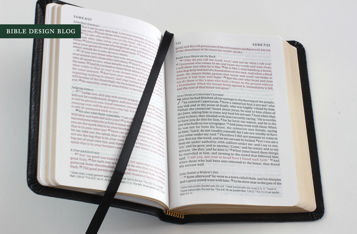
Textual notes are at the bottom of the page, and there are no cross-references. This is a largely reader-friendly presentation of the New Testament, easy to scan for pleasure and still useful for looking things up.
BINDING
There are two binding options to choose from, a TruTone edition in Coffee (a dark variegated brown), and a black genuine leather edition. Neither one of them opens flat. In the past I've recommended TruTone covers over genuine leather, which tends to be stiff, bottom basement stuff. (Whenever I say the words aloud, I pronounce it gen-u-wine for effect.) To my surprise I have gravitated toward the black in this case. While it isn't limp, it's pliable enough that I have started telling myself it's perfectly serviceable. What I'd love, of course, is to have one of these great little book blocks rebound in limp leather.
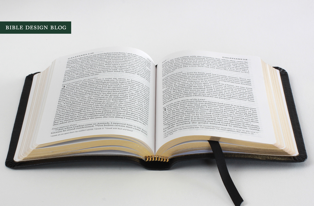
The Pocket New Testament can be wrestled into opening flat (see above), but I usually hold it open with my hand while reading. If you try making it stay open near the front or back, it starts closing itself after a moment. The red-letter photo up top illustrates this. I had to snap it quick before the pages shut!
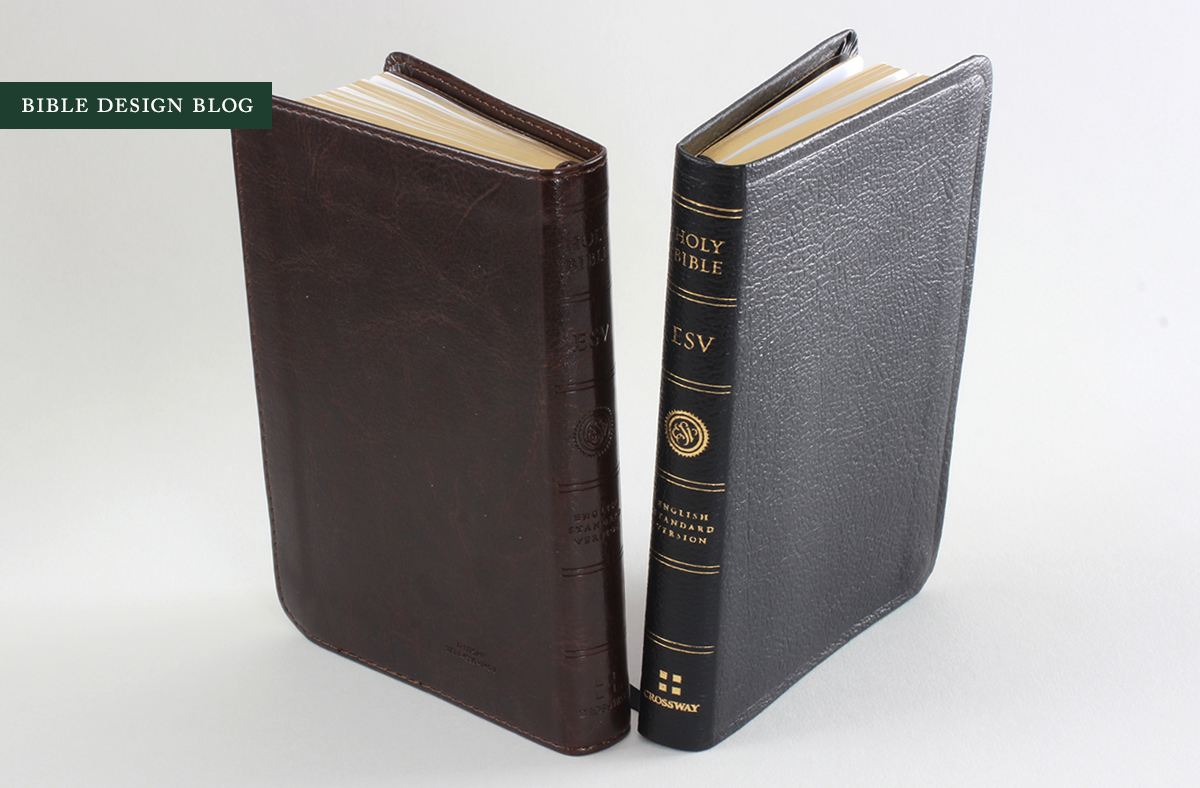
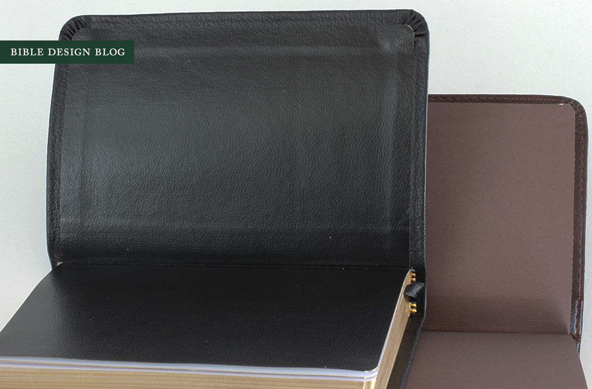
Aesthetically, the Coffee TruTone looks nicer than the genuine leather. What I don't like is how slick to the touch it feels. The paper lining isn't as nice as the black edition's liner, either. Typing the words "I prefer the black to the brown" comes difficult for me. I keep second guessing and holding them both up to the light for another look. Still, there's no going back. Unless you're going to have this little NT rebound, the genuine leather one is more pleasant to handle and has nicer finishing.
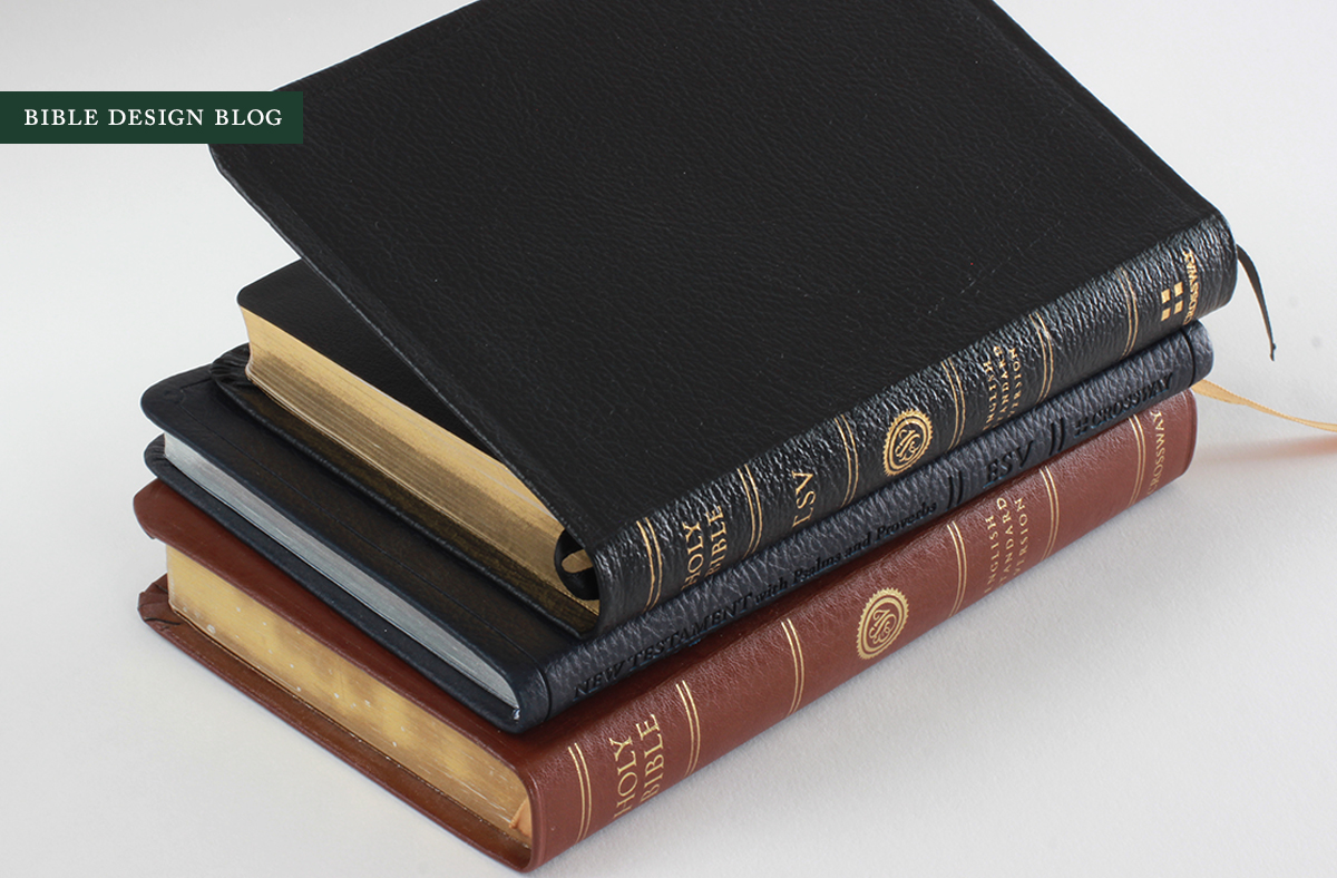
To give you a sense of what a 4" x 5.5" x 0.75" New Testament feels like, let's compare it to a couple of comparable editions from Crossway. The photo below illustrates the black Pocket New Testament (top), the blue TruTone Compact New Testament (middle), and the original Compact Thinline ESV circa 2003 (bottom) in British Tan Premium Bonded Leather. The Compact New Testament is a nice vest-pocket edition measuring 4" x 6" x 0.375" -- a double column setting that's nowhere near as pleasant to read. While it's more compact than the Pocket New Testament, I can't imagine choosing the Compact over the Pocket.
The Compact Thinline ESV reminds me of a funny story. The first time I visited Crossway, that Bible came up in conversation. I was about to say how much I loved mine (despite the bonded leather, despite the glued binding) when they volunteered, "We know everybody hates it. We know the type is way too small." I played along, but the whole time my brain kept saying, Too small? Does not compute. The fact that it's the whole text of Scripture and I can tuck it into a suit jacket pocket and forget it's there is the reason I've never parted from it all these years, despite the fact that someone spilled coffee all over it resulting in wavy pages and a rich patina.
There's something about that 4" x 6" form factor that speaks to me -- and maybe that's the reason I can't help dreaming of a whole Bible in the style of this Pocket New Testament. Thick and compact, with this splendid paper and a lovely single column setting. I'd be in small Bible heaven, if there is such a place.
CONCLUSIONS
The Pocket New Testament is one of the three must-have editions Crossway has released so far this year, the other two being the ESV Reader's Bible and The Psalms. Each in its own way highlights the strengths of reader-friendly design over the reference-oriented layouts most Bibles still employ. The Pocket New Testament is special to me personally, though, because it was a single column NT that really kindled my passion for reader-friendly Bible design. The Cambridge REB New Testament, long out of print, set the bar high, and this edition is a worthy successor (plus it includes the Psalms and Proverbs, which the Cambridge did not).
I've always been a fan of pocket New Testaments. If you're anything like me, the ESV Pocket New Testament is a real treat.
J. Mark Bertrand is a novelist and pastor whose writing on Bible design has helped spark a publishing revolution. Mark is the author of Rethinking Worldview: Learning to Think, Live, and Speak in This World (Crossway, 2007), as well as the novels Back on Murder, Pattern of Wounds, and Nothing to Hide—described as a “series worth getting attached to” (Christianity Today) by “a major crime fiction talent” (Weekly Standard) in the vein of Michael Connelly, Ian Rankin, and Henning Mankell.
Mark has a BA in English Literature from Union University, an MFA in Creative Writing from the University of Houston, and an M.Div. from Heidelberg Theological Seminary. Through his influential Bible Design Blog, Mark has championed a new generation of readable Bibles. He is a founding member of the steering committee of the Society of Bible Craftsmanship, and chairs the Society’s Award Committee. His work was featured in the November 2021 issue of FaithLife’s Bible Study Magazine.
Mark also serves on the board of Worldview Academy, where he has been a member of the faculty of theology since 2003. Since 2017, he has been an ordained teaching elder in the Presbyterian Church in America. He and his wife Laurie life in Sioux Falls, South Dakota.
