Crossway's Wide Margin Reference Bible in Black Top Grain Leather
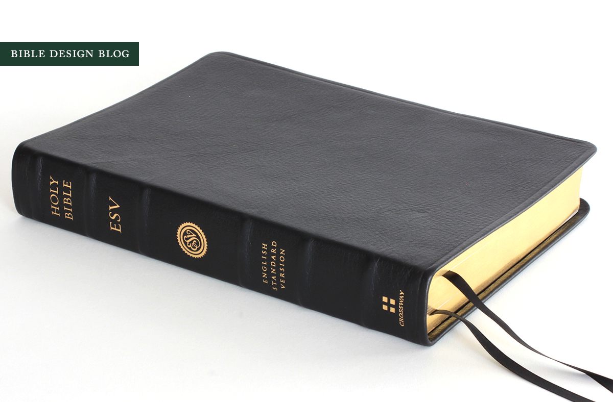
 OVERVIEWSince the beginning I've preached the virtues of a wide margin Bible, believing the extra space around the text gives you the means of creating what is essentially a personal study Bible. Over time you annotate more and more passages with notes you find particularly helpful. They're handy for lesson outlines, quotes from other sources, and cross references of your own making. The flip side is, once you've committed to a wide margin edition, you stick with it for ages. Printed and bound in China using Top Grain Leather (presumably cowhide), the new Crossway Wide Margin Reference ESV carries a suggested retail price of $159.99, with a street price of about $110. The question is whether this is the wide margin Bible you'll stick to. Let's find out.
DESIGN NOTES & PAPER
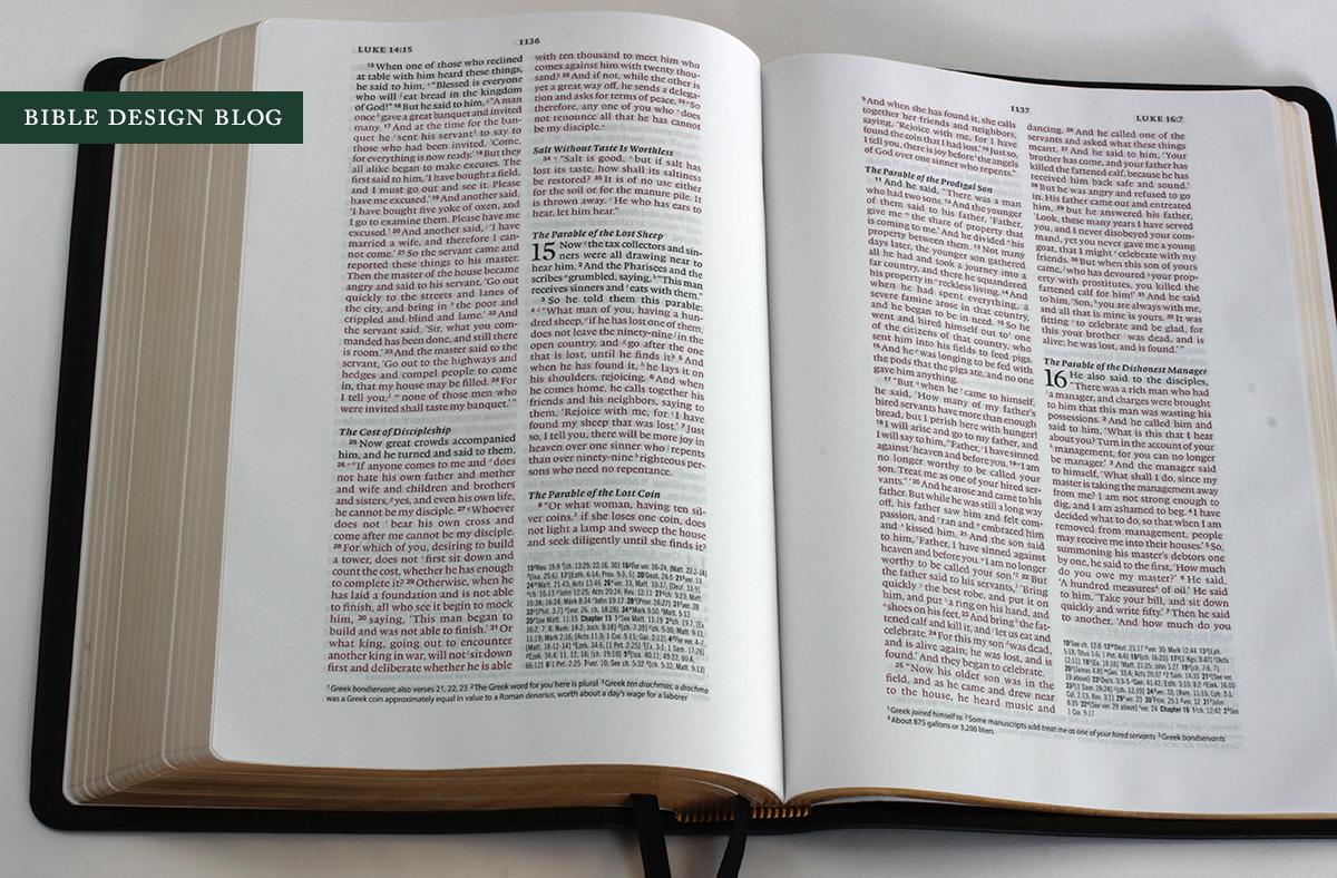
The Wide Margin Reference ESV features a traditional double column text setting with 9 pt. type, one-inch margins, cross-references, a concordance, and full-color maps in back. This is a red-letter edition, continuing the nineteenth century practice of printing the words of Christ in red, a popular choice in the American market, where people generally don't realize how recent an innovation it is. As you can see from the photographs, the red print is well-executed; it looks red rather than pink or orange, which is a common problem. So far, so good. This is a fairly standard, unsurprising piece of design.
Then you notice that while the Wide Margin Reference does have cross-references, they're not in the usual center column. Instead you'll find them in the lower right-hand column of each page, set apart from the biblical text. (Textual notes span the bottom of the page in subscript.) The same idea is followed in the Schuyler Quentel except the orientation is reversed, with the textual notes at the bottom of the column and the references spanning the bottom of the page. I find the Quentel cross-references a bit easier to decipher, but with practice this should be an easy method to pick up.
Despite the absence of center column references, I still find the narrow column width wreaks havoc when the text is set in verse, forcing too many unintended line breaks, dicing up the poetry and often leaving a single word stranded on a line by itself.
My copy of the Wide Margin Reference has a nice, dark print impression and good line matching. I wasn't able to find any examples of mismatched lines, which is nice. The paper impressed me favorably, too -- in fact, all of the recent Crossway editions I've seen recently with China-printed book blocks have displayed good opacity and whiteness. There is some show-through, but I only really notice it in poetry sections, and don't find it distracting. Obviously, in poor light the effect is more pronounced.
BINDING The Wide Margin Reference's edge-lined binding recalls the style of Nelson's long-gone Signature Series and Crossway's Abba-bound editions. Crossway has worked with the printer in China to upgrade the fit and finish of their top grain leather bindings. I'm impressed with what they've accomplished. The corners are neatly turned and there's no reinforcing stitch around the edge of the cover. I was pleased with how uniform the edges are. Everything's nice and symmetrical, with no glue showing and no weird gaps or notches. The black leather is soft and limp with a dull matte finish and attractive grain.
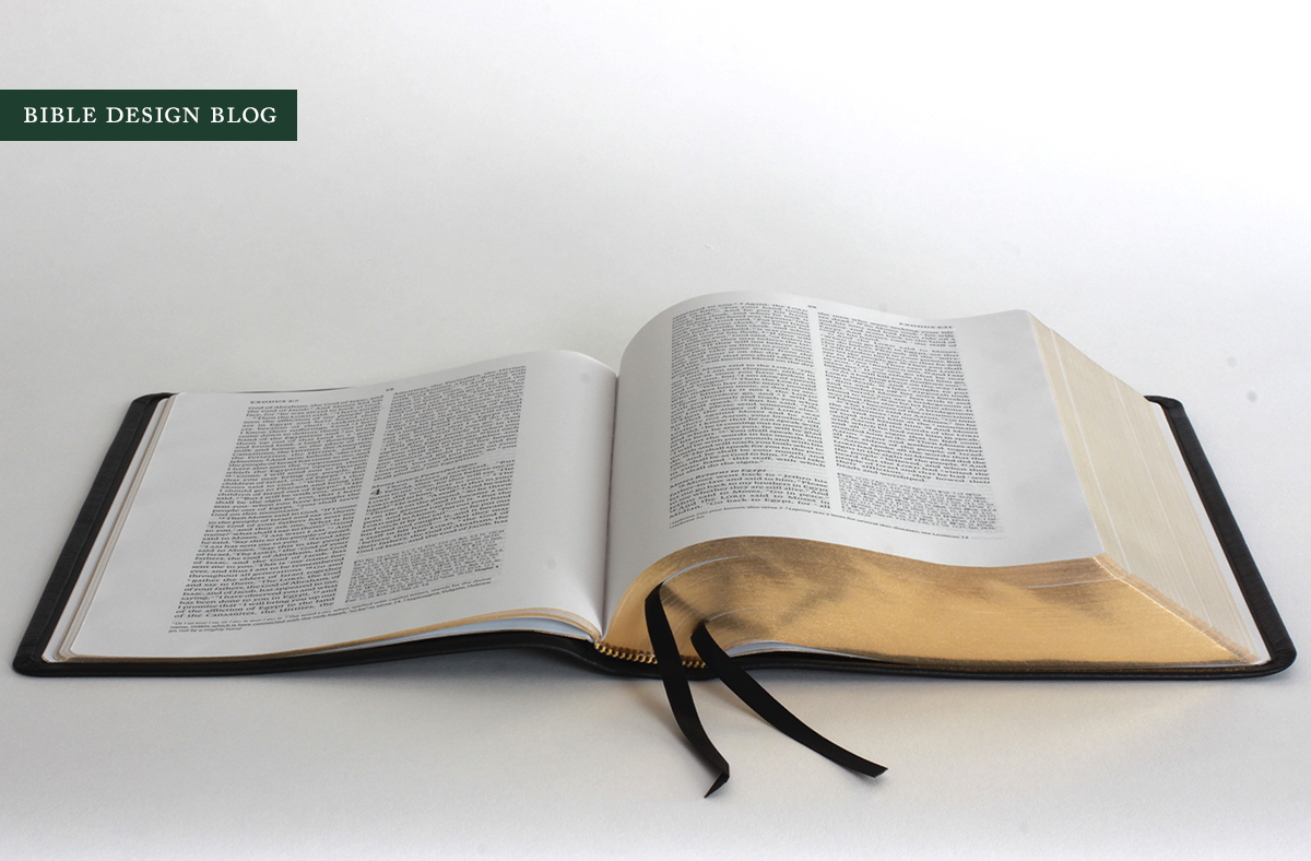
A limp binding has to pass two tests: you should be able to bend the cover back on itself without doing any damage or encountering much resistance, and the book ought to open flat on a table. The Wide Margin Reference performs both tasks without difficulty. The first hurdle is what I call "Bible yoga," in which the book is curled back to demonstrate the pliability of the cover. Edge-lined bindings, without stiff board underneath, fare best in this evaluation. This is not a practical posture for Bible reading by any means, but it helps us visualize how the book will feel in the hand.
The second test, opening flat, is one a lot of Bibles have trouble with, even those made to a quality standard. I don't know why some bindings are too tight to open completely -- some start that way and loosen up with use -- but if I had my way, publishers would insist that the printer get this right and send back copies that don't measure up. A book that opens flat on the table is a pleasure no matter what the cover is made of, while a book that keeps snapping shut, regardless of materials, can't help but frustrate. This one opens flat right out of the box, even toward the front and back.
COMPARISON
The obvious comparison to make would be between this Wide Margin Reference and the Wide Margin Edition from Cambridge. The Cambridge edition is wider overall and sports a wider outer margin, a point in its favor. The Crossway, however, comes with a wider inner margin which makes annotating interior columns much easier. Another advantage of the Crossway layout is that missing center column for references, which helps accommodate the larger 9 pt. type, a full point more than the Cambridge's 8 pt. (though in practice I'm not sure you can tell much of a difference). My Cambridge has art-gilt edges, nicer paper, a nicer cover, and -- most important -- my personal notes. While I'm impressed with the Crossway Wide Margin Reference, I'm not impressed enough to make a switch. If you're interested in trying a wide margin for the first time, though, this one is top notch.
CONCLUSIONS
The question I asked at the beginning was whether this is the wide margin you'll stick with. People who use wide margins aren't as prone to skipping around from one Bible to another. They want to keep their notes in one place, which means a long term working relationship. The problem with the Wide Margin Reference for my purposes is that it's a double column setting, which requires both inner and outer margins to be widened. This layout delivers ... but a single column with a wide outer margin would be a much more efficient design. Instead of four columns -- two for text, two for notes -- on each page, you'd have just two. That's what I want out of a wide margin edition, personally, and so far the closest thing I've found is Crossway's Legacy ESV.
Having said that, in the realm of traditional double column wide margin editions (i.e., the ones that actually exist, as opposed to the ones I daydream about), this edition has a lot going for it. The quality is nice, the cross reference system is fresh, and the type is large by Bible standards, with good-sized margins on both sides of the text. So what do you think? Is this a Bible you could stick with for the long haul? Tell me what you think in the comments.
J. Mark Bertrand is a novelist and pastor whose writing on Bible design has helped spark a publishing revolution. Mark is the author of Rethinking Worldview: Learning to Think, Live, and Speak in This World (Crossway, 2007), as well as the novels Back on Murder, Pattern of Wounds, and Nothing to Hide—described as a “series worth getting attached to” (Christianity Today) by “a major crime fiction talent” (Weekly Standard) in the vein of Michael Connelly, Ian Rankin, and Henning Mankell.
Mark has a BA in English Literature from Union University, an MFA in Creative Writing from the University of Houston, and an M.Div. from Heidelberg Theological Seminary. Through his influential Bible Design Blog, Mark has championed a new generation of readable Bibles. He is a founding member of the steering committee of the Society of Bible Craftsmanship, and chairs the Society’s Award Committee. His work was featured in the November 2021 issue of FaithLife’s Bible Study Magazine.
Mark also serves on the board of Worldview Academy, where he has been a member of the faculty of theology since 2003. Since 2017, he has been an ordained teaching elder in the Presbyterian Church in America. He and his wife Laurie life in Sioux Falls, South Dakota.


