
Crossway ESV Reader's Bible (Cloth Bound Hardcover)
 OVERVIEW
The ESV Reader's Bible almost got me killed. Due to a shipping snafu, I had to pick up the package across town -- and naturally I couldn't wait before ripping it open for a look. If texting and driving is a bad idea, skimming the Bible behind the wheel is even worse. After looking up from the book of Ephesians to find myself veering into the opposite lane, I decided to put the Reader's Bible back in its slipcase.
Until I reached the next red light, that is.
DESIGN NOTES & PAPER
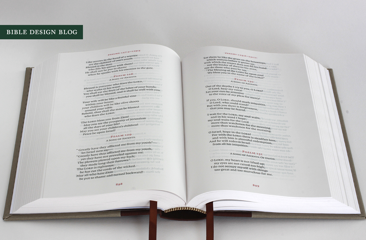
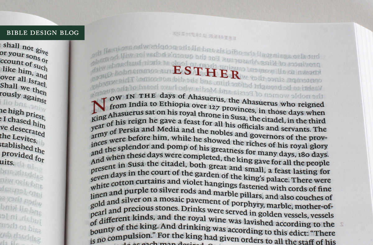
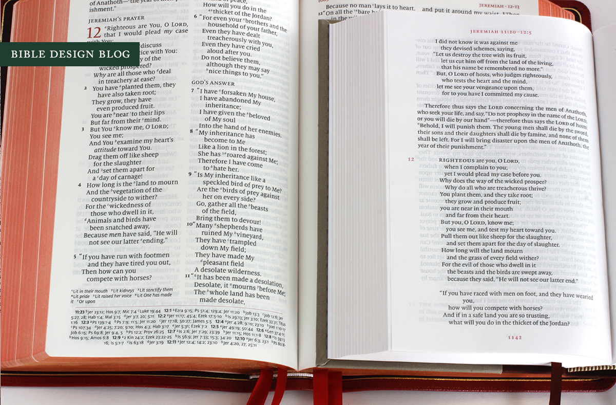
Even though I knew pretty much what to expect, the Reader's Bible still surprised me. It's a 5.5" x 8" clothbound hardcover that comes in a heavy duty slipcase, opens flat, and features a single column text setting in 9 pt. type with elegant accents in red -- chapter numbers, headers, and page numbers. The big news, I suppose, is that there are no verse numbers in the Reader's Bible. The page headers give a verse range, so finding specific passages isn't all that hard. But this edition is meant for reading, not looking stuff up.
This isn't the first Bible to be labeled a Reader's Bible, but it is the first to reflect my idea of what a Bible designed for readers should look like. Let's say there are two philosophies. One goes like this: most people who complain about not being able to read the Bible easily focus on the difficulty of deciphering small type, therefore a Bible for readers should have large type. The Allan Reader's Editions have taken this tack, and they are basically large print reference Bibles. The design hasn't changed; it's simply been enlarged. The critical apparatus, the textual notes and cross-references, have been retained.
Take a look at the last prose book you read and see if it was a large print, multi-column reference work. Probably not. Most of the books we sit and read are formatted in a time-tested, reader-friendly layout designed to call as little attention to itself as possible in order to let the text itself shine. They are single column, paragraphed books with a minimum of distraction. The second approach to a reader's edition involves designing the Bible to look like the kind of books we typically read for pleasure. That's exactly what you find when you open the ESV Reader's Bible. A book that sends no mixed signals, clearly intended to be read.

The header and footer are centered on each page and printed in red. The text column is 3.75" wide, allowing more than half an inch margin on either side. Because the book opens flat, there is plenty of room in the gutter without losing any of the text. Chapters are designated with a small red numeral in the margin and begin with capitalized words. The first chapter of each book is indicated not with a number but with a red drop cap. The overall effect is restrained and classy.
The Reader's Bible layout uniformly shines, but I have a soft spot for the poetry. Verse always looks better in single column settings. The addition of the red accents elevates the look even more, particularly in the psalms.
If the Crossway Legacy's 36 gsm ThinCoat Plus paper represents a beau ideal, as some of us think, a good balance between opacity and thickness, the question is how close to that mark the Reader's Bible comes. I knew in advance it would not use the same paper as the Legacy, and since paper quality can make or break a new edition, I worried that the Reader's Bible would let itself down in this category. The paper is not as opaque as the ThinCoat Plus, or its close-enough competitor Apple Thin Opaque 36 gsm, used in the new ESV Pocket New Testament.
Instead, the Reader's Bible uses Apple Thin Opaque 30 gsm, which has an 84% opacity rating. In fact, it's the same rating as the 45 gsm paper used in the Schuyler Quentel NASB (we'll see in a moment how the two compare, though). As you can see in the photos, the Reader's Bible manifests some show-through or ghosting, that five o'clock shadow that results from printing on the reverse of the page showing through to the front. The differences in opacity between Bibles from 27 gsm to 45 gsm are measured in single digits, so I find it hard sometimes to say how much better one paper is from another. But to my eye, the Reader's Bible has a bit more show-through than the Schuyler and the Legacy, and perhaps a bit less than the Clarion. We'll examine the matter more closely below.
BINDING
Is it silly to get excited about a slipcover? Then call me silly. One of the questions I'm often asked is how to store and transport Bibles. While I don't believe in babying them, I do find myself missing the old Cambridge slipcases of yore, which let me tuck a volume into my briefcase and never worry about bent pages or scuffed covers. Not to mention, a slipcased book looks so nice on the shelf. The Reader's Bible comes in a sturdy branded slipcase that will really come in handy.

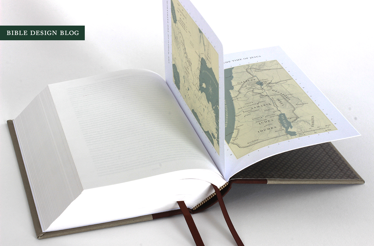
The Reader's Bible also opens perfectly flat, as a good book should. This makes reading a pleasure, since you can set the book on the table before you and flip pages as you go. It's a handy volume, too, about an inch and a quarter thick, easy to hold while reading (and quite nice for reading in bed). There are two ribbons to mark your spot.

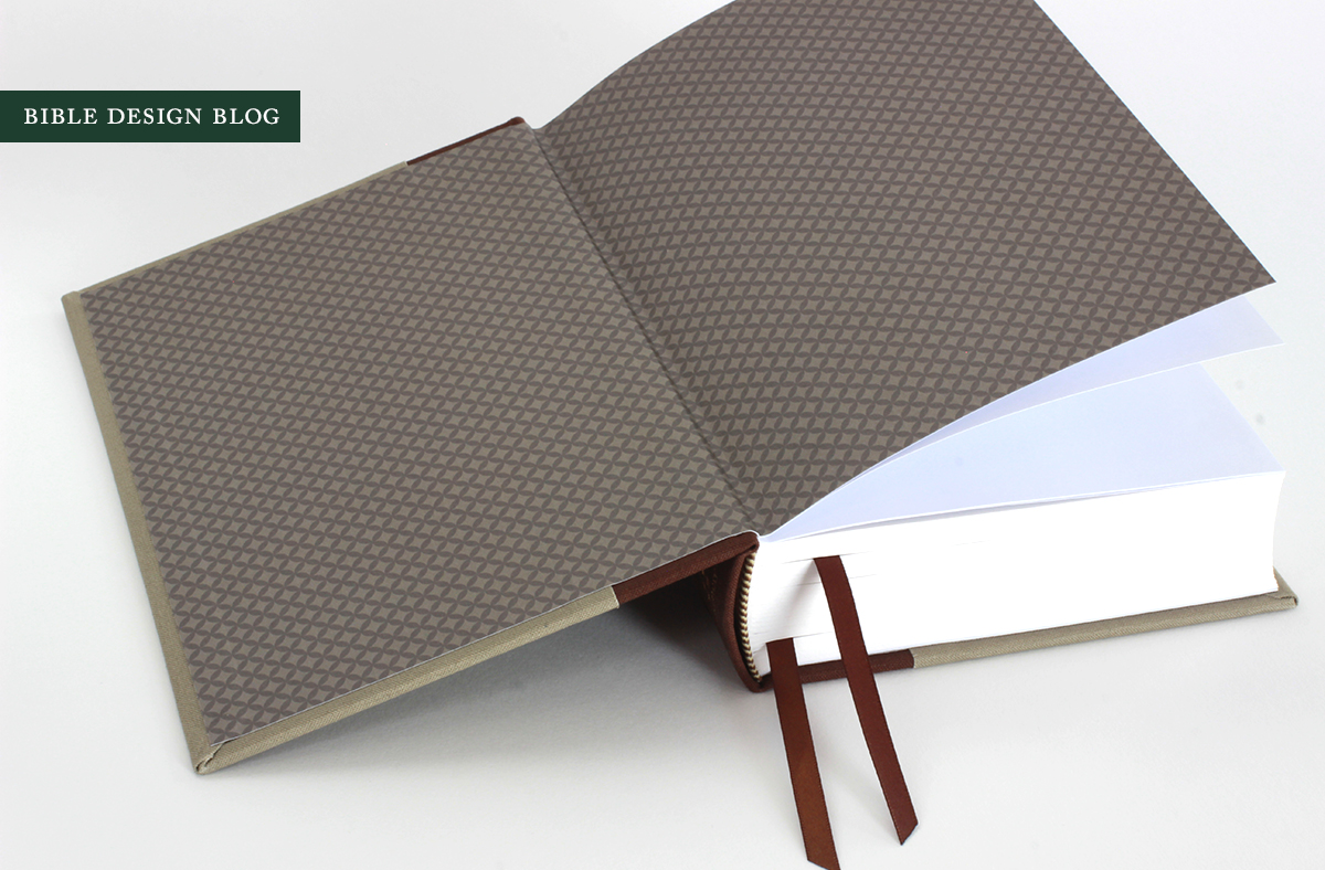 The printed endpapers (above) are attractive, and there are maps in back (below). I think I would have chosen a different color palette for the hardcover -- the earth tones don't do much for me -- but it's a nicely produced volume with good attention to detail.
COMPARISONS
I want to compare the Reader's Bible to several popular alternatives. But first the comparison that's really begging to be made is this: the Reader's Bible reminds me a lot of a Library of America edition. If you're not familiar with Library of America, it's a noble publishing venture intent on introducing authoritative reader-friendly editions of great American literature -- fiction, non-fiction, poetry, journalism, historical writing, you name it. They publish clothbound hardcovers, either slipcased or with black dust jackets, printed on thin paper to keep the volumes relatively trim. I made a hole on my shelf and slipped the Reader's Bible among some Library of America books. It looked right at home.
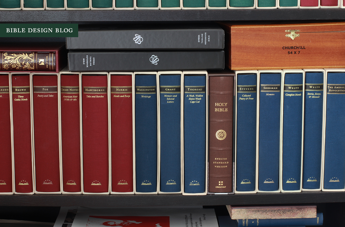
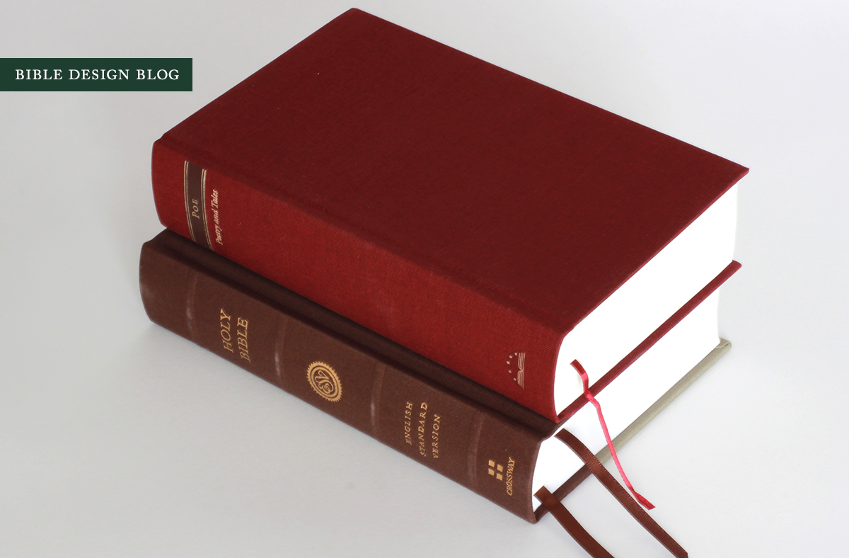
The Reader's Edition is roughly the same size as Edgar Allan Poe's Poetry and Tales, so I snapped a couple of comparison shots, first of the two volumes together, and second a comparison of layout and paper.
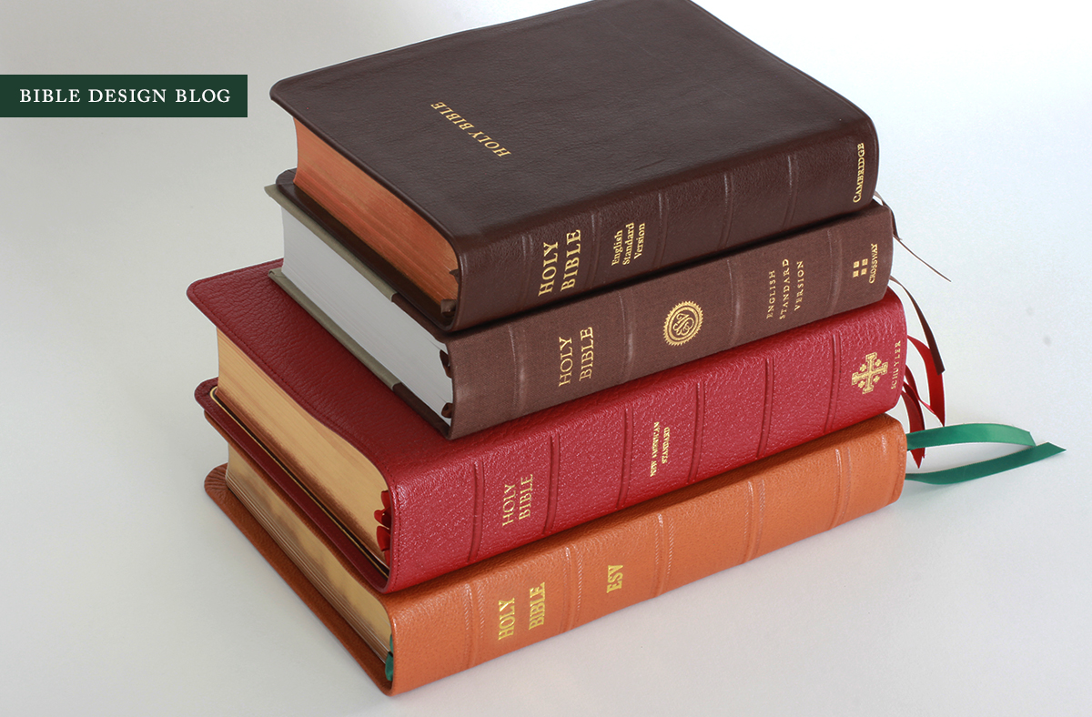
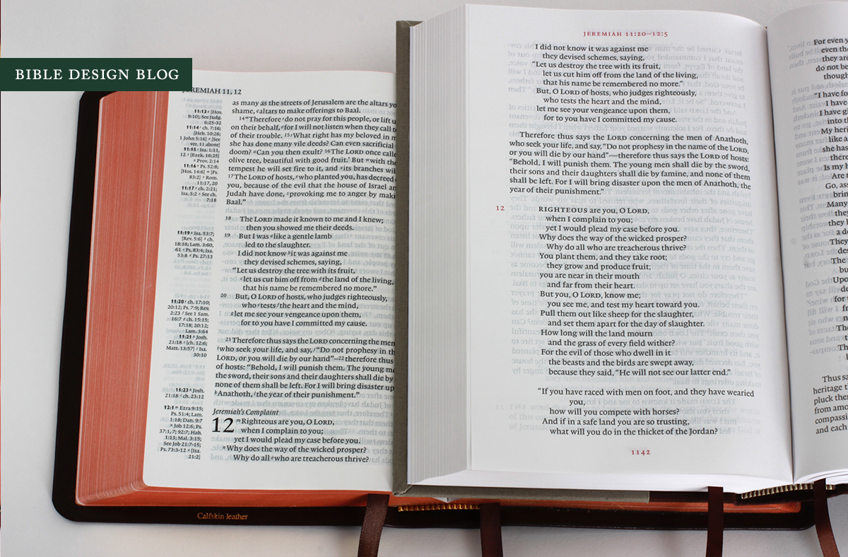
 This resemblance, to me, is a fine thing. But you're probably wondering how the Reader's Edition stacks up against other Bibles. I put together a short list of competitors, each with an affinity of some sort to the Reader's Bible. I chose the Cambridge Clarion ESV because the two Bibles are both single column settings of roughly the same size. I added the Schuyler Quentel NASB, a very different sort of edition, because it also uses red accents in printing and I was curious whether two papers with such a range of thickness -- 32 gsm vs 45 gsm -- could really be comparable in terms of opacity. Finally, the Crossway Legacy was an obvious choice because it's also a single column setting without references.
The contenders (below): Cambridge Clarion, ESV Reader's Bible, Schuyler Quentel NASB, Crossway Legacy (rebound by Leonard's).
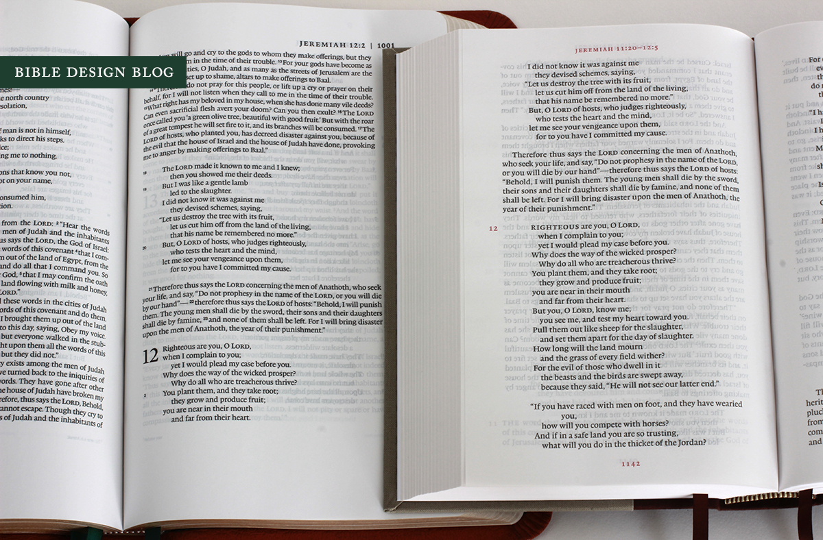
Below, the Legacy (left) compared to the Reader's Bible (right). While the Legacy shows less ghosting, the Reader's Bible is quite a bit handier, and the red accents look nicer. Note how the de-emphasized chapter number and absence of verse numbers in the Reader's Bible are evident, even compared to a minimalist layout like the Legacy, which keeps them subtle. Unlike the Legacy's section headings in the margin, the Reader's Bible does away with the headings entirely.
Now let's see how the Reader's Bible looks compared to the Schuyler Quentel. Despite the Quentel's larger type, I think the single column verses are easier to scan. The Quentel's paper feels nicer, and the printing might possess the edge -- but all things considered, the Reader's Bible comes off looking quite good, don't you think? And it's considerably smaller.
The closest apples-to-apples comparison is probably between the Cambridge Clarion and the Reader's Bible. The Clarion is slightly narrower, though comparable in width. The 27 gsm paper suffers in comparison where show-through is concerned. All three of the comparison Bibles locate the page header on the upper corner of the page, while the Reader's Bible centers them. If you're a "sword drill" aficionado you'll know that the centered header makes flipping through the pages at speed to find your place a bit more difficult.
CONCLUSIONS
Crossway is offering the Reader's Bible in two editions, the hardcover seen here and a TruTone binding, with street prices running from $22-$30. That's not a high price to pay for the uncluttered "pure" reading experience this unique Bible offers. In many ways, the Reader's Bible takes the dream expressed in something like The Books of the Bible and -- by paying attention to the design and binding -- delivers on the unfulfilled promise. A Bible without all the clutter, intended to be read. I'd love to see one of these on everyone's shelf, regardless of your preferred translation. This is a format to spend some time with in the hope of recapturing a less mediated experience of reading the Bible.
UPDATED JUNE 26, 2014
BUY THE ESV READER’S BIBLE FROM WTSBOOKS.COM
The ESV Reader’s Bible has generated a lot of excitement, not least among our friends at wtsbooks.com. They are selling every edition of the ESV Reader’s Bible, including the hardcover shown here, for 50% off of retail. If you order using one of the links below, some credit accrues to Bible Design Blog as well, so you’re helping yourself and the blog at the same time.
ESV Reader’s Bible: Hardcover Edition
ESV Reader’s Bible: Walnut TruTone Edition
ESV Reader’s Bible: Black TruTone Edition
REGISTER FOR ESV READER’S BIBLE GIVEAWAY
You can also register for the wtsbooks.com giveaway for a chance to receive a free copy of the hardcover ESV Reader’s Bible. All you have to do is send an e-mail to promo@wtsbooks.com.
J. Mark Bertrand is a novelist and pastor whose writing on Bible design has helped spark a publishing revolution. Mark is the author of Rethinking Worldview: Learning to Think, Live, and Speak in This World (Crossway, 2007), as well as the novels Back on Murder, Pattern of Wounds, and Nothing to Hide—described as a “series worth getting attached to” (Christianity Today) by “a major crime fiction talent” (Weekly Standard) in the vein of Michael Connelly, Ian Rankin, and Henning Mankell.
Mark has a BA in English Literature from Union University, an MFA in Creative Writing from the University of Houston, and an M.Div. from Heidelberg Theological Seminary. Through his influential Bible Design Blog, Mark has championed a new generation of readable Bibles. He is a founding member of the steering committee of the Society of Bible Craftsmanship, and chairs the Society’s Award Committee. His work was featured in the November 2021 issue of FaithLife’s Bible Study Magazine.
Mark also serves on the board of Worldview Academy, where he has been a member of the faculty of theology since 2003. Since 2017, he has been an ordained teaching elder in the Presbyterian Church in America. He and his wife Laurie life in Sioux Falls, South Dakota.