
R. L. Allan New Classic Readers Edition ESV in Marine Blue Goatskin (ESVNC1BLT)
 OVERVIEW
For the second time in a week, I am posting about a sold-out color option from R. L. Allan. The Brunswick Green NLT was last time's object of design, and today it's the New Classic Readers Edition ESV in Marine Blue. Black, brown, and tan are still available -- and lovely colors they are -- but when you see the photos, it's easy to understand why the blue sold out quickly. The book blocks for the Readers Edition are printed by Jongbloed in the Netherlands and then bound for Allan in London. While Jongbloed bindings are improving all the time (as seen in Schuyler and other Allan editions) I don't think anyone rivals that London bindery at its best. That makes this edition, at least in terms of printing and binding, the best of both worlds.
DESIGN NOTES & PAPER
My only quibble is with the designation of this Bible as a Readers Edition. This is a large print reference Bible (10 pt. font to be exact) with a footprint of roughly 6" x 9" x 1.25". Crossway's designation for this book block is "New Classic Reference Special Edition," and if you think of it as a deluxe run of the New Classic Reference, you'll know where you are. The layout has not been specially designed for reader-friendliness. It's a double column text setting with relatively narrow columns (just over 2") that accommodate a center column reference system. The logic of Reader Editions from Allan has always been that what makes the Bible hard to read is smaller type and poorer paper, so they enlarge an existing layout to boost the type size and have it printed on higher spec paper. My belief has always been that Bibles intended for reading will be designed differently than Bibles intended for looking things up. This layout falls into the latter category. While the larger type and better paper do make reading easier, the design is not optimized for reading. It's a reference Bible, pure and simple.
Once you make that mental shift and look at this as a really awesome special edition of the ESV New Classic Reference, it starts to make a whole lot of sense. The familiar text setting gets an upgrade in every respect, that best-of-both-worlds combination I mentioned at the beginning. The first Allan ESV was a rebound Classic Reference, and this one is a worthy heir and successor.

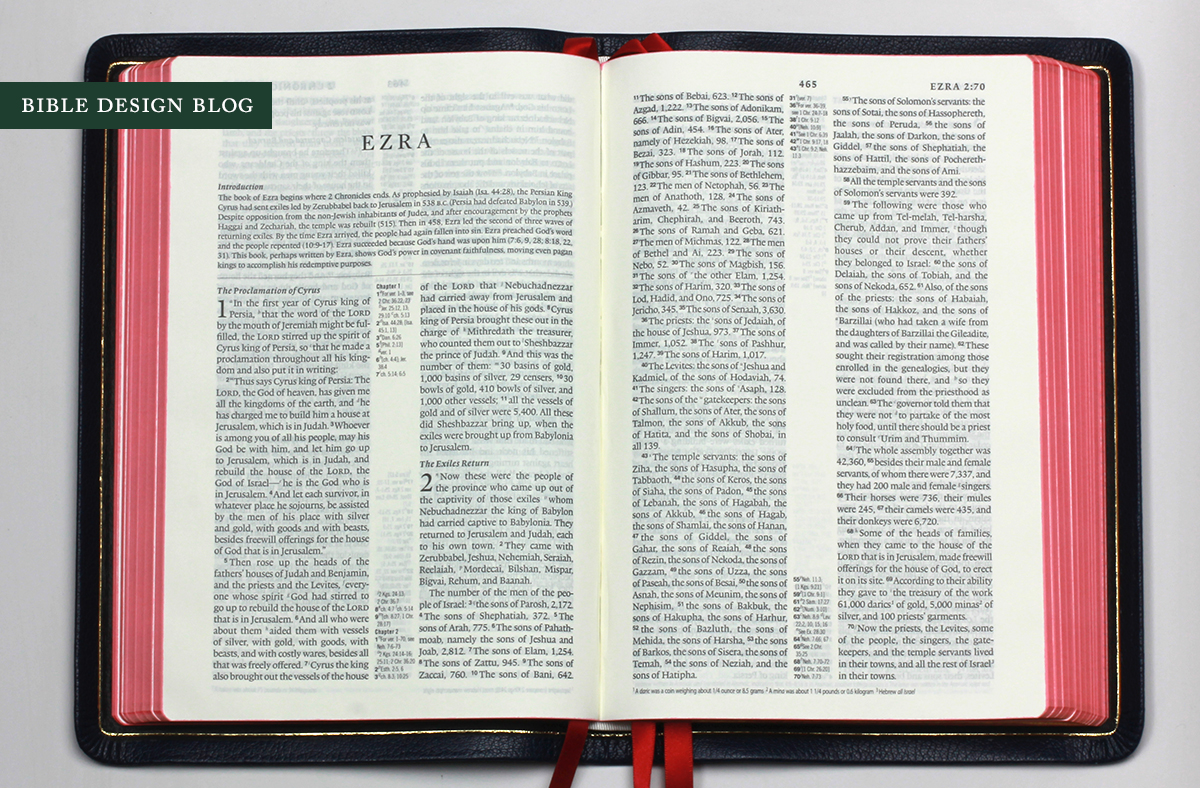
The photos above and below illustrate the good and the not-so-good when it comes to the Classic Reference design. It's a clean, readable reference edition -- I've always found the references especially easy to use -- with an Achilles' heel: the way the narrow columns chew up poetic verse. See, for example, Hebrews 3 above. Verse 8 and 9 not only give us instances of a single word stranded all alone on a line, but also of part of a word: -derness. Isaiah 59, below, is full of these isolated words. In verses 10-11 alone we have "blind," "light," none," and "us." The translators versified the poetry with much longer lines in mind, but the design doesn't take that into consideration. As a double column setting, it almost can't.

The trade-off, I suppose, is that when the narrow columns feature paragraphed text, they are very quick to scan, in the same way a newspaper is. While you can't appreciate this from the photos, the Readers Edition's larger size also mitigates the original Classic Reference's somewhat awkward proportion -- it's a little narrow for its height. While this is no thinline, it really feels like one in the hand, showing off the limp binding in a way the earlier Allan ESVs based on the Classic Reference never did.
One of the complaints about the original Readers Edition in 2009 was that, despite the upgraded paper, there was still a surprising amount of show through. I took this up in my original review of that Bible, and the question is, how does the new edition compare? These are always tricky comparisons to make. It's not black-and-white, but shades of grey. (Get it?) I think the photos of both editions bear me out in saying that the New Classic Readers has improved on that count. As always, there is show through, but it's consistent with what we see in other Bibles of this quality, and doesn't stand out as exceptional.
BINDING
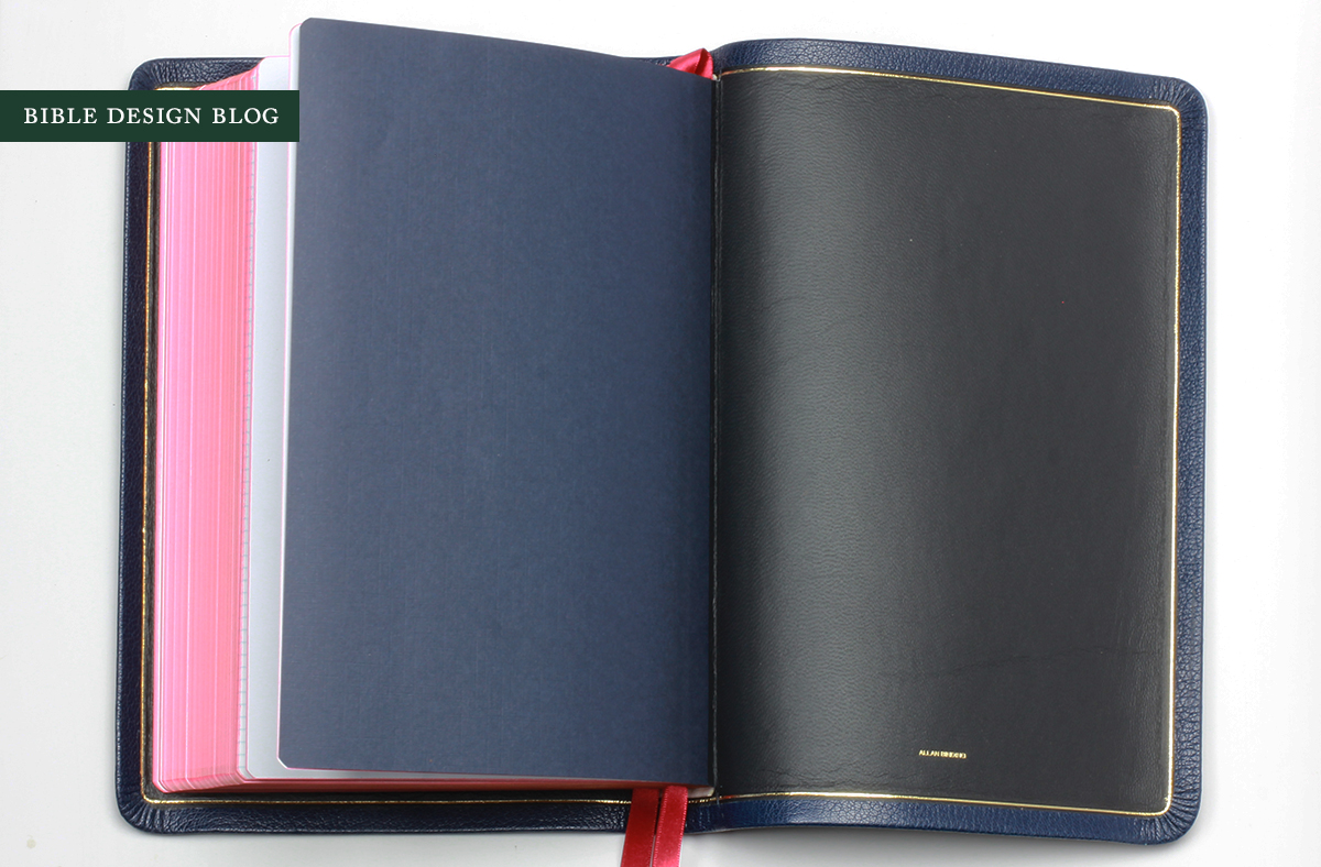
You know what I really like about the Readers Edition pictured here? The blue cover paired with art-gilt pages. Allan Bibles in blue have gotten in the habit of coming with blue-under-gold instead of red-under-gold edges. I like it. It's different and interesting. But the more time I spent with this Bible, the more I found myself thinking how classy it looks, how refined. Where the blue-under-gold treatment seems to brighten things up, red-under-gold tones them down. It's a nice choice with this particular shade of blue, which can read quite dark depending on the lighting.
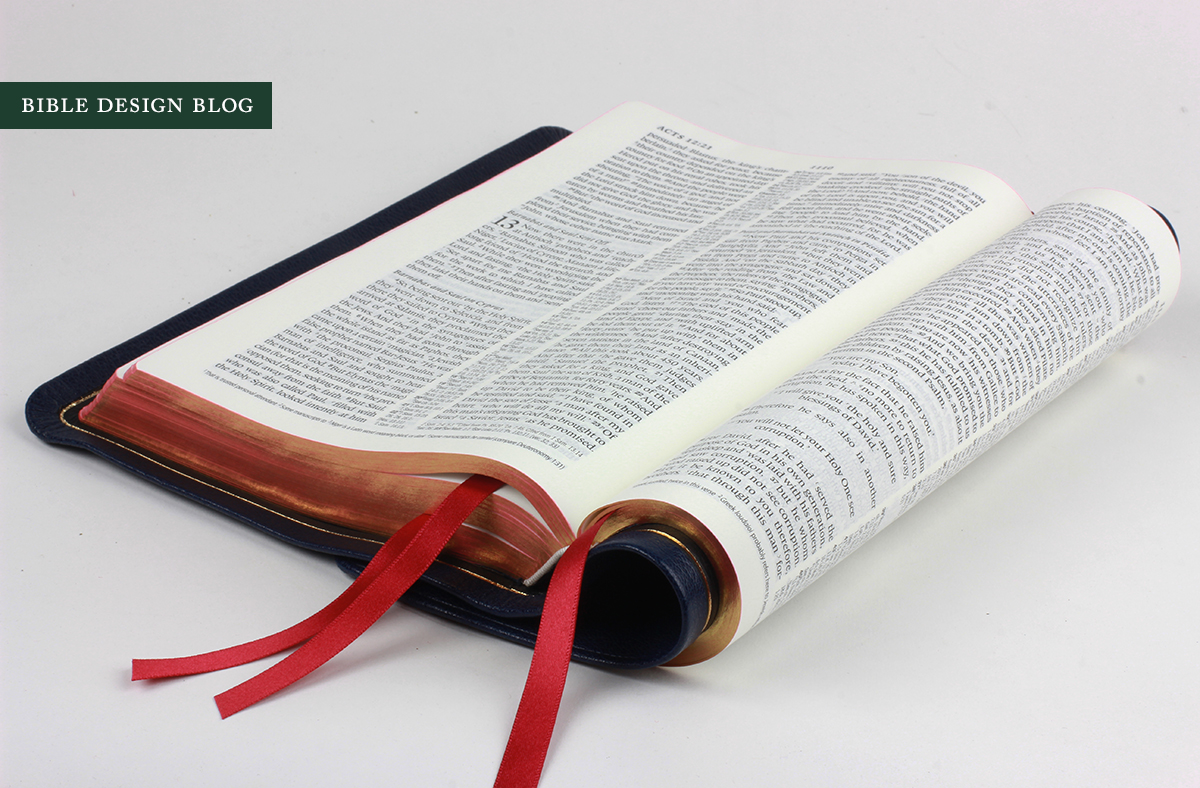
R. L. Allan has always been a beacon of quality where bindings are concerned, and over the past few years they've established a house style that serves them well. Natural goatskin covers, edge-lined for limp flexibility, overlapping or semi-yapp edges, art-gilding, three thick ribbon place markers, and lined paper bound with the maps in back. There are variations, of course, but this is more or less what we've come to expect from Allan. It's what they do best. When this kind of binding is combined with a quality book block, as it is here, everything shines.
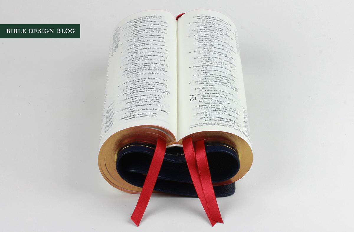
Bible yoga (above) is a great way to appreciate through still images what the cover feels like in your hand. Like most Allan covers, this leather has an old school thin, hard finish that goes well with its limp structure. It's at the opposite end of the spectrum from the soft matte-finish covers that are equally popular.
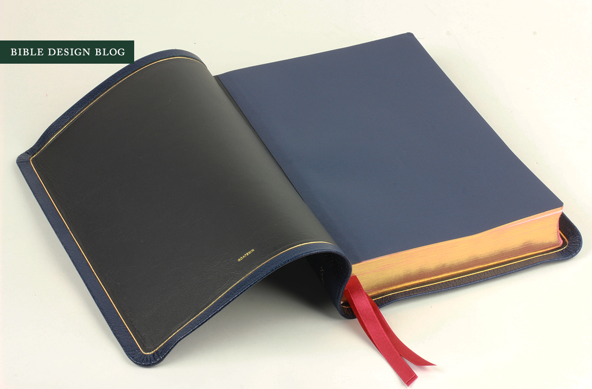
I'm tempted to point out the black lining as a misstep, wishing it had been blue, but to be honest, the color does go with this combination, like black wingtips with a navy suit. So I'm not going to get on my usual high horse about color bindings with black liners.


CONCLUSIONS
I am burning for Allan to add a single column ESV to the lineup now that there are several to choose from. Every time I handle one of these exquisite bindings, I imagine what my Legacy book block would feel like with such a cover. In the meantime, though, I have to admit, everything about the Readers Edition is exceptionally nice. If you want a large print reference edition with good paper and a great binding, this makes a wonderful option.
The other reason I like the Readers Edition is that it hints at what R. L. Allan could do if, in addition to rebinding existing book blocks from other publishers, they took the Schuyler route and did some of their own. The best Allan editions these days are the ones that either begin with exceptional book blocks or specially commission them, as here. There's a growing expectation that nice bindings demand nice book blocks, and I think it's essential for publishers to meet that expectation. This Bible does that very well. It's a great example of the Allan magic at its best.
J. Mark Bertrand is a novelist and pastor whose writing on Bible design has helped spark a publishing revolution. Mark is the author of Rethinking Worldview: Learning to Think, Live, and Speak in This World (Crossway, 2007), as well as the novels Back on Murder, Pattern of Wounds, and Nothing to Hide—described as a “series worth getting attached to” (Christianity Today) by “a major crime fiction talent” (Weekly Standard) in the vein of Michael Connelly, Ian Rankin, and Henning Mankell.
Mark has a BA in English Literature from Union University, an MFA in Creative Writing from the University of Houston, and an M.Div. from Heidelberg Theological Seminary. Through his influential Bible Design Blog, Mark has championed a new generation of readable Bibles. He is a founding member of the steering committee of the Society of Bible Craftsmanship, and chairs the Society’s Award Committee. His work was featured in the November 2021 issue of FaithLife’s Bible Study Magazine.
Mark also serves on the board of Worldview Academy, where he has been a member of the faculty of theology since 2003. Since 2017, he has been an ordained teaching elder in the Presbyterian Church in America. He and his wife Laurie life in Sioux Falls, South Dakota.