
First Look: Crossway's ESV Reader's Bible
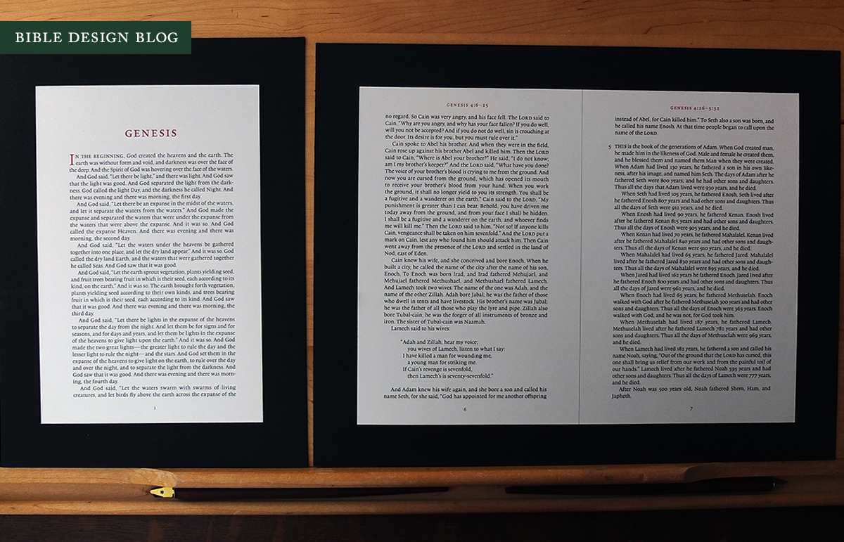
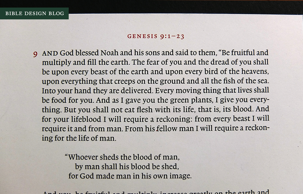
 The most interesting of the Bibles slated for release by Crossway in 2014 has to be the ESV Reader's Bible, which features one of the purest, most uncluttered layouts we have seen in a long time. The Reader's Bible looks like a book meant to be read: the 9 pt. text is set in a single column and paragraphed. There are no cross references, no superscript notes, and even the verse numbers have been done away with. A running header at the top of the page locates you in terms of book, chapter, and verse range -- but chapter numbers are whisked off to the margin. The header, the chapter numbers, and the page numbers are printed in dark red, setting them apart from the text itself.
Now that Crossway has released a PDF preview of the interior layout, you can take the Reader's Bible for a test drive. I received mockups of several page spreads and a blank sample of the hardcover edition, so I can offer some insight into both the design and form factor. The snapshots in this post depict pages from the Reader's Bible pasted onto black poster board. Since they're hard copies, they give a slightly different sense of how the Reader's Bible will appear than viewing the PDF online. However, please remember that these images do not represent the final paper. They're output on very opaque stock. No matter how opaque the paper Crossway ends up choosing is, it won't be this opaque.
What makes for a reader-friendly Bible? If you take any edition of the Bible, enlarge the scale, and print a new run on more opaque paper, you will have a reader-friendlier book than you had to begin with. This is how most publishers up to now have approached the problem of making Bibles for reading. The design hasn't changed, only the execution. Now execution is important, and the success or failure of the ESV Reader's Bible when it releases in May will depend a great deal on the quality of printing and paper. Before press work and paper become a factor, though, there's the question of design.
Traditionally Bibles have been designed more like reference works than books meant for reading, and this has subtly influenced the way we use them. A Bible for readers ought to look like the books you read start-to-finish. Some people use "looking like a novel" as a shorthand, but single-column paragraphed text is standard both for fiction and non-fiction. When you open such a book, the design is transparent. It simply works, without calling attention to itself. The text, not the layout, is what shines.

The only difference between the ESV Reader's Bible and the typical book is the type size, which is still small compared to the histories and novels on my nightstand. There are few distractions on the page, nothing to pull you out of the text. The proportions are elegant. The design team at Crossway has made it look easy, but I know from experience that it isn't. In some ways, I think the Reader's Bible represents the apotheosis of several years' worth of good design coming out of the Crossway shop. Nothing here is out of step or novel in comparison with recent editions. The Reader's Bible is a rigorous distillation of the necessities and nothing else.
One of my favorite personal design projects is creating the order of worship for our church each week. Our services are Scripture rich, full of readings short and long, and when I design these passages I remove all the apparatus but the text itself. The emphasis is on the words alone. This is the experience you get from the Reader's Bible, about as unmediated as you'll find. If you're coming from an old two-column, verse-by-verse setting, the change will be shocking, invigorating -- it's as if someone just cleaned the pane of glass you've been staring through. If you already use a single column, paragraphed setting, the shift will be more subtle. Even though I've been using the ESV Legacy a lot recently, which is free of cross references and notes, with only chapter and verse numbers inserted, I find the Reader's Bible cleaner and less distracting.
The mock-up hardcover is a little larger than my Cambridge Clarion, but easily hand-sized. It's comparable in scale to medium-sized hardcover, though of course the page count makes it thick. As of now, this cloth-over-board cover and a couple of TruTone bindings are all we have to look forward to. I'm not disappointed ... but only because I love hardcovers for their practicality and TruTones for their suitability for rebinding. The mock-up opens flat and looks pretty nice.


Don't get me wrong: I would love to see Crossway do a Netherlands-printed, goatskin-bound edition of the Reader's Bible. But I will be quite happy to get my hands on the humble hardcover, which will make a wonderful reader.
This is a first look at a Bible that doesn't exist yet. When we see it in May, the question will be how well the Reader's Bible fulfills its promise. Judging by what we see here, I'd say that potential is huge. If the printing is good and the paper sufficiently opaque (I'm hoping for Legacy-level opacity, at least) then we will have an affordable, beautifully-designed Bible optimized for pure reading. I am happy to see Crossway releasing such a unique edition. I can hardly wait until May.
J. Mark Bertrand is a novelist and pastor whose writing on Bible design has helped spark a publishing revolution. Mark is the author of Rethinking Worldview: Learning to Think, Live, and Speak in This World (Crossway, 2007), as well as the novels Back on Murder, Pattern of Wounds, and Nothing to Hide—described as a “series worth getting attached to” (Christianity Today) by “a major crime fiction talent” (Weekly Standard) in the vein of Michael Connelly, Ian Rankin, and Henning Mankell.
Mark has a BA in English Literature from Union University, an MFA in Creative Writing from the University of Houston, and an M.Div. from Heidelberg Theological Seminary. Through his influential Bible Design Blog, Mark has championed a new generation of readable Bibles. He is a founding member of the steering committee of the Society of Bible Craftsmanship, and chairs the Society’s Award Committee. His work was featured in the November 2021 issue of FaithLife’s Bible Study Magazine.
Mark also serves on the board of Worldview Academy, where he has been a member of the faculty of theology since 2003. Since 2017, he has been an ordained teaching elder in the Presbyterian Church in America. He and his wife Laurie life in Sioux Falls, South Dakota.