Cambridge ESV Pitt Minion (Four Editions)
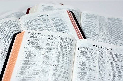
I picked up my first Pitt Minion at a Dublin cathedral bookstore a few years before Cambridge re-introduced the format. Printed by the Trinitarian Bible Society, it features a rugged, grainy calfskin binding with vinyl lining, semi-yapp covers, two ribbons, and art-gilt pages. Whenever they saw it, people would ask where I'd found it and how they could get one, too. So I haven't been at all surprised by the success the format has enjoyed since Cambridge brought it back. Now it seems that the Pitt Minion and the wide margin based on the same setting are the one-two punch in the Cambridge line-up. Various evangelical-friendly translations -- the KJV, the NIV, the NKJV, the NASB -- are available in this combination, and now the ESV is following suit. The Pitt Minions are officially on the market, with the wide margins expected to follow later this year or early next.
 Above: Two options in goatskin -- black and brown -- and a third in burgundy French morocco. The imitation leather is not pictured, but just wait...
 Above: I never store softcover, leather-bound Bibles on their edges like this, but I just wanted to show that they hold their own on a crowded shelf.
Earlier this year, I reviewed the NKJV Pitt Minion in black goatskin. Just about everything I said there applies to the ESV Pitt Minion, too. There's no need for suspense in this case, so I won't make you wait until the end of the review to find out whether these things are any good. They're great. The ESV Pitt Minion is available in four bindings: two goatskins (black and brown), burgundy French morocco, and a two-tone tan and red imitation leather. They're all excellent -- no surprised there -- and which one you choose will have more to do with aesthetic preferences than anything else.
 Above: Using the brown goatskin edition for a morning read. There's only one ribbon, but don't succumb to the temptation of using a leaf marker!
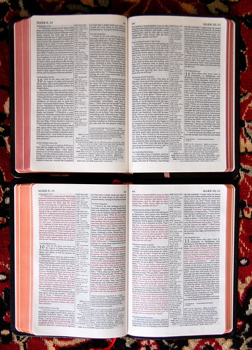
Above: Red letter or black? It's your choice. The brown goatskin (top) and imitation leather leather editions feature black letter, which means the words of Christ are not set off in red ink, while the black goatskin (bottom) and burgundy French morocco editions give Americans what they want.
PITT MINION 101
As I've mentioned elsewhere, I personally prefer thicker, smaller Bibles to thinner, larger ones. The heft feels good in the hand. (At least, it does if you wear a size 9 glove like me. The small-handed among us might beg to differ.) Having said that, I've always like the Pitt Minion, perhaps because of the way it defies categorization. It's not tiny, but it's not big.
If the Pitt Minion were a person, we'd suspect it of an eating disorder. Its larger-than-compact proportions only emphasize the spine's extreme leanness. This must be the secret of the format's success. While it feels small in the hand, it doesn't read small. No one will confuse it with a large print edition, but the type size is about right for a handy Bible, and you get a full complement of cross references. You can take the Pitt Minion with you to church or a Bible study and not feel like you've left something essential behind.
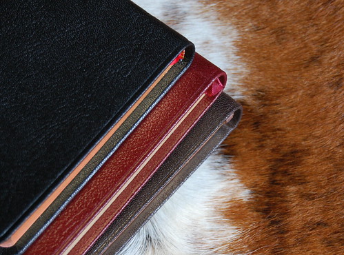
Above: Goatskin and French morocco ... meet cowhide. While I personally prefer the brown, there's no denying that each option has its own charms.
Since the ESV Pitt Minions arrived on my doorstep, I've been using the brown goatskin edition constantly for study, for church, and for casual reading. There are better Bibles for each application, but few as good at doing everything well. As an all-arounder, a Bible for the person who's only going to invest in one, this format makes a lot of sense.
NOTES ON THE BLACK GOATSKIN EDITION
The most traditional of the four offerings is of course the black goatskin. It comes with art-gilt ("red under gold") page edges, a single red ribbon, and the words of Christ in red, which is standard in the American market. Comparing the ESV version with the NKJV I reviewed earlier, there are only two substantial differences. The ESV's reference column is wider, which results in the text columns being marginally narrower. In terms of harmony, the balance achieved in the NKJV and NIV Pitt Minions is more attractive, but it didn't take me long to get used to the ESV's appearance.
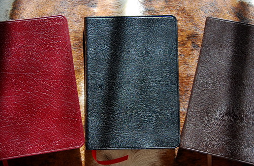
Above: Black (center) is the traditional option, with burgundy a close second. Brown is a tasteful, un-flashy alternative, perhaps a bit less formal.
The second difference has to do with the goatskin. The ESV covers seem just a bit stiffer and less pliable than the goatskin used on the NKJV and NIV. After a lot of tactile back-and-forth, I'm thinking the boards on the ESVs must be a bit thicker or stiffer than those used in the earlier Pitt Minions. It's a shame, but I can't say it detracts much from my overall satisfaction. As much as I appreciate the liquidity of the larger wide margins, the thing that makes the Pitt Minion "work" is the way it springs open flat. For those who prefer a supple but firm cover, these will be great. They are still flexible, especially in comparison to the stiffer French morocco.
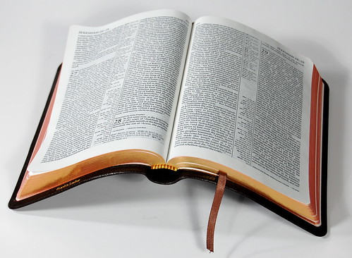
Above: While the cover isn't exactly liquid, the Pitt Minions still open flat and make for an excellent hand-held reader.

Above: As you can see, the cover seems to attach farther outside the text block than usual, perhaps contributing to the Pitt Minion's unique, flat-open feel. There's nothing else quite like it.
NOTES ON THE BROWN GOATSKIN EDITION
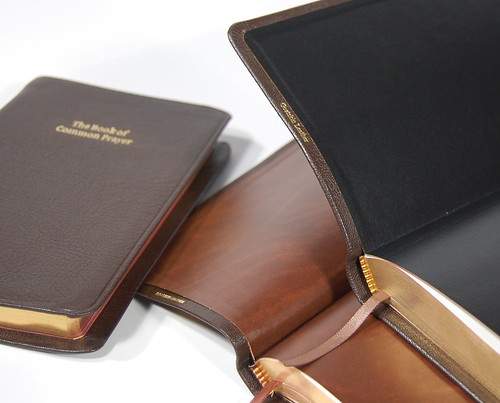
Brown . . . what can I say? I love it in very variation, from light tan to the darkest mahogany. So it's no surprise that my favorite edition of the four is the brown goatskin. The first thing I did was whip out the other brown goatskin Cambridges -- the KJV Pitt Minion and the large-print Book of Common Prayer -- for a little side-by-side comparison. The shading is pretty consistent, though of course there is variation between them both in terms of color and grain, this being a natural product and all. The imprinting on my brown ESV is more crisp. While the cover itself is not quite as flexible as the KJV's, the fact that it opens perfectly flat where the KJV doesn't makes it far preferable.
Let me repeat that: a stiffer cover combined with the ability to open flat is better than a limper cover on a Bible that doesn't open flat. In fact, for my money, a cheap hardback that opens flat is better than a deluxe goatskin jewel-encrusted fairy-dust-impregnated edition that doesn't. Because opening flat makes all the difference in usability. It's easier on the eye and the hand.
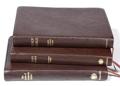
Above: They make a pretty trio.

Above: The ESV and BCP pair off. Size-wise, an excellent fit.
If there is one thing I prefer about the KJV edition, though, it's the lining. The KJV is lined in a lighter brown with an almost marbled variation in color. By contrast, the ESV is lined in black. The brown is a more attractive lining choice, as you can see:
In terms of goatskin, which to choose -- black or brown? In terms of layout or quality, there is no difference, so it's purely an aesthetic decision. If you require a red letter edition, go with the black. If not, brown offers a unique change of pace.
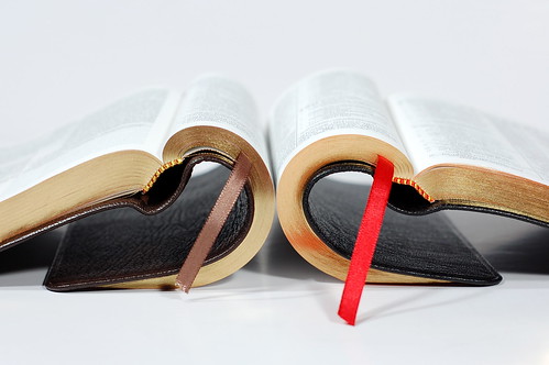
Above: The brown goatskin (left) and black goatskin demonstrate their flexibility. All four of the editions open flat, but the goatskin is more supple than the French morocco. The imitation leather we'll get to in a sec.
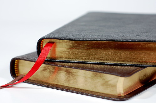
Above: Art-gilt ("red under gold") edges on the goatskin editions, with plain gold on the morocco and imitation leather.
NOTES ON THE FRENCH MOROCCO EDITION
I've noted before that something's happened in the world of French morocco. A vintage Cambridge Bible bound in French morocco often sported a thinner, more flexible cover than its calfskin compadre, but these days the morocco seems to be stiff, thicker, and less glossy -- overall, a less refined option. So when I saw that a burgundy edition of the ESV Pitt Minion would be offered in morocco, I couldn't see the point. After handling it, though, I'm happy to say that, while it won't win any flexibility competitions with the goatskin (or vintage morocco), this is not the stiff, coarse stuff of recent years.
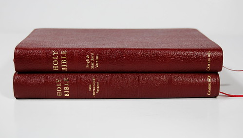
Above: A study in red. The ESV in French morocco (top) compared to the NIV Pitt Minion in burgundy goatskin. While the goatskin handles better, the morocco looks great and would make an excellent choice if this is your color preference.
As you can see, instead of the purplish, muddy, wine-red hue I expect when someone says 'burgundy,' here the shade has a healthy dose of scarlet. If you ask me, this could pass for red -- and we all know how much I like red Bibles!
NOTES ON THE IMITATION LEATHER EDITION
And then there's the oddball of the assortment, the imitation leather. There is only one thing not to like about this one, and it's the color. Everything else is jaw-droppingly good. My preference would have been for a single-tone edition in tan, the predominant color here, getting rid of the Frankenbible seam. That preference was strengthened by the realization that, in ever other respect, this edition is every bit as good as the others. It opens flat. It's flexible. The tan is quite attractive. Compared to other polyurethane covers, the level of fit and finish is just superb.
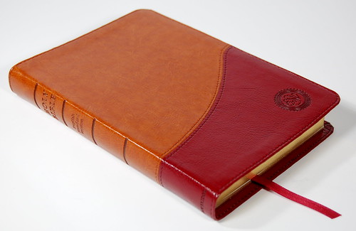
Above: I don't know what the fascination with two-tone covers is, but it leaves me cold. Having said that, this is the best cover of its class I've ever seen. If it were all tan, it could rear its head in the company of any leather and be unashamed.
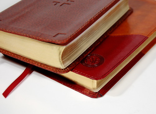
Above: Compared to the Deluxe Compact ESV from Crossway (top), the Pitt Minion shows an extreme level of refinement. Nice, tight detailing, no loose threads. The Pitt Minion has a tackier surface feel, but that's about it.
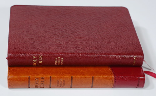
Above: The two "lower end" options don't feel low end at all. With the Pitt Minion, there really isn't a bad choice.
WHAT I LOVE
What I love about the ESV is the way it splits the difference between the traditional language I grew up with and the need for clarity and comprehension today. No translation is perfect, but this one has served me pretty well the past few years. In the beginning, there were so few options, and now we're spoiled for choices. In a sense, the Pitt Minion is a great vehicle for the ESV, because it represents a similar attempt at compromise. No, it doesn't have the largest type, and it doesn't have the most features, but for all around use, it cheats out the competition more often than not. It's small enough to carry, full-featured enough to use, and does one thing better than any other leather-bound edition I've reviewed: it opens flat like it really wants to stay that way. And Cambridge has made it available in an unprecedented range of cover options.
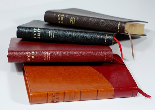
Above: The four editions, one on top of the other. Which look do you prefer?
So faced with the four options, which would I choose? No suspense here. The brown goatskin. But surprisingly, I can't bring myself to say that if you choose differently, you'll be missing out. I prefer black letter editions, but the red letter versions here are executed well, in nice dark ink that doesn't diminish readability. I prefer goatskin, but because all four open flat equally well, I'm not sure there's really a tactile advantage. With softer boards under the leather, that might change, but even so . . . you can't really go wrong no matter which you choose.
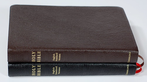
Above: I gave all four to my wife and let her choose one for herself. She narrowed it down to the goatskin editions by feel, and after a hairy moment when it looked like she'd snatch my favorite, she went with the black instead.
The moral of the story is this. Because the Pitt Minions are so good inside, you find yourself not caring so much about the outside. Goatskin? Great. Morocco? Cool. Plastic? Neat. It's a secondary consideration when all four open flat, feature an attractive, classic layout and decent paper. At the end of the day, it's not the covers that make the Pitt Minion a great edition, it's this:
They measure just 5 1/8 inches across, just 7 3/8 tall, and maybe 7/8 of an inch thick. Compact, in other words. They open flat. If you can get by without reading glasses, you can probably cope with the smaller type. If you use the ESV, this is a format that will prove quite handy. Once again, the Pitt Minion demonstrates just why it's become a classic.
J. Mark Bertrand is a novelist and pastor whose writing on Bible design has helped spark a publishing revolution. Mark is the author of Rethinking Worldview: Learning to Think, Live, and Speak in This World (Crossway, 2007), as well as the novels Back on Murder, Pattern of Wounds, and Nothing to Hide—described as a “series worth getting attached to” (Christianity Today) by “a major crime fiction talent” (Weekly Standard) in the vein of Michael Connelly, Ian Rankin, and Henning Mankell.
Mark has a BA in English Literature from Union University, an MFA in Creative Writing from the University of Houston, and an M.Div. from Heidelberg Theological Seminary. Through his influential Bible Design Blog, Mark has championed a new generation of readable Bibles. He is a founding member of the steering committee of the Society of Bible Craftsmanship, and chairs the Society’s Award Committee. His work was featured in the November 2021 issue of FaithLife’s Bible Study Magazine.
Mark also serves on the board of Worldview Academy, where he has been a member of the faculty of theology since 2003. Since 2017, he has been an ordained teaching elder in the Presbyterian Church in America. He and his wife Laurie life in Sioux Falls, South Dakota.

