
Cambridge Pitt Minion NKJV in Black Goatskin
This is going to break some hearts. Six or seven years ago, my friend Darrel Schiel, who was then the intrepid manager at the now-defunct Grapevine Books, made a habit of buying seconds from Baker, which he sold to customers at a discount. As you know, Baker distributes Cambridge Bibles in the United States, so it was no surprise when a bundle of French Morocco-bound KJV Pitt Minions arrived. They were seconds, too, though I could never quite figure out why, covered in shrink-wrap and offered for about $20 each. The color selection was impressive: black and burgundy, naturally, but also green and blue. I stocked up and used them as giveaways.
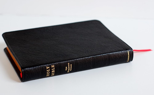 Above: The Cambridge Pitt Minion NKJV in Black Goatskin.
When Cambridge re-introduced the Pitt Minion KJV, I was already familiar with the format. During my search for quality-bound Bibles, I'd discovered the Trinitarian Bible Society, which offered an older edition of the Pitt Minion in black calfskin with two ribbons and art-gilt edges. I actually bought mine during a visit to Dublin, then tracked the TBS down online when I got home and ordered some more of their editions. I was impressed. The Pitt Minion is essentially a small thinline reference Bible, poised right at the cusp of hand-sized and tiny, with relatively readable type for its size.
THE COMPACT CHALLENGE If you've been reading these short essays for long, you know I have an affinity for small Bibles. I don't want to exaggerate -- I use and recommend pretty much every format, and since we have the luxury of a variety of editions (a rare thing, historically and geographically), I suppose we might as well suit the size to the task -- but when I think of the quintessential Bible, the one-size-does-all Platonic ideal, it tends to have a small footprint. Why? Because I like the idea of a Bible you can carry around easily, handy and discreet. The editions I use most tend to be the compact ones.
And therein lies the challenge. Because I'm also one of those people who prefers a Bible (any book, really) to be flexible, even liquid in the hand. Not everyone is. I know some of you like the structure offered by a moderately stiff cover, and as long as it opens flat I can relate. But again, my ideal is limp, and that's not such a common characteristic of small Bibles. (For that matter, neither is opening flat.)
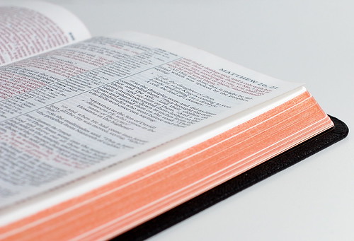
Above: The grain, as you'd expect, is beautiful, the fit and finish excellent.
A larger Bible has some factors weighing in its favor in this regard. The thickness and weight of the paper lends a feeling of flexibility to many larger editions. The current crop of goatskin-bound Cambridge wide margins are a perfect example. The covers are incredibly flexible, but the added size and weight of the text block takes full advantage of that, resulting in a feeling of absolute indolence. Those Bibles have no backbone, in the best possible sense.
But smaller ones, by definition, lack the size and weight, so it can take a lot of use to make them supple -- and even then, there's no guarantee.
THE GOATSKIN PITT MINION
Which is why, when I first heard about the goatskin editions of the Pitt Minion, I was intrigued. My calfskin version from the Trinitarian Bible Society had grown quite flexible with use -- not limp, but comfortably soft -- and the French Morocco seconds I'd picked up at Grapevine were similarly pliable. They bucked the trend where smaller Bibles are concerned. So how much more could a goatskin cover really offer?
I have three goatskin Pitt Minions on hand to compare: a black NKJV, a burgundy NIV, and a brown KJV. At first, I was planning to cover all three in a single go, but I decided to take them one at a time, so we could get a better sense of each one. By and large, they're the same, but there are some small differences worth noting. So in this review, I'm going to focus on the black NKJV.
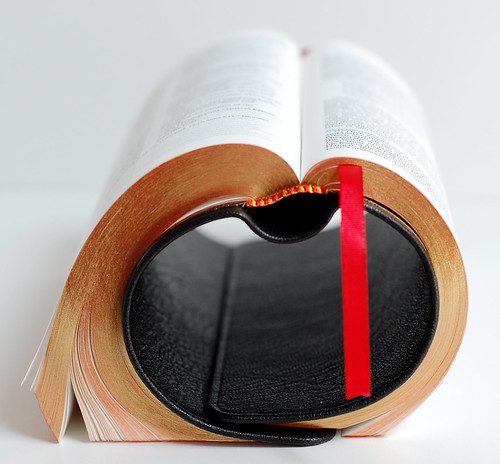
It was extraordinarily limp right out of the box -- no surprise. But what did surprise me was how ready it was to open flat. My calf and morocco Pitt Minions, in spite of their flexible covers, have never wanted to stay open on a table, but this NKJV did so without hesitation. In fact, it seemed to open wider than the typical edition, so that I could see right into the gutter without any difficulty. Most books have a swell or curve to the pages, so when you open them flat on a table and look from the bottom, the two sides form a 'V' in the middle. The gutter is at the bottom of a deep canyon, as it were. The Pitt Minion's 'v' is lower case, like it's not trying to hard to sit up. (This is a characteristic of both the NKJV and the burgundy NIV, but the brown KJV -- like its calf and morocco cousins -- doesn't open flat like this.)
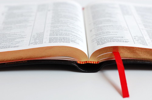
Above: The Pitt Minion seems to open more fully than many Bibles, especially smaller ones.
I can't explain why the text block lays so flat, but it does, and as a result, the Pitt Minion is great for one-handed use. When I hold most small Bibles one-handed, I keep three fingers behind the spine while placing thumb and pinkie on the inside edges -- imagine a makeshift music stand with a bad manicure. This keeps the Bible open wide enough for comfortable reading, and is similar to the way you might hold a mass market paperback. But the Pitt Minion doesn't need it. It stays open much more easily.
THE STANDARD OF BEAUTY
Thin is in these days, with our Bibles getting to be as anorexic-looking as our models. Looking at all the thinlines on the shelf, you feel this overwhelming urge to feed them. The real problem, of course, with thinlines (and, I suppose, with models) is how they get to be so thin. Hint: it's not by using thicker paper. Peruse the comments on BibleDesignBlog.com and you'll quickly discover that the number one complaint about Bibles these days -- even more aggravating, it seems, than adhesive bindings -- is how translucent the paper has become. (Some people call this "bleedthrough," referencing the ghosted impression of the printing on the reverse of the page, but that term always makes me think of ink bleeding through when you write on the paper.)
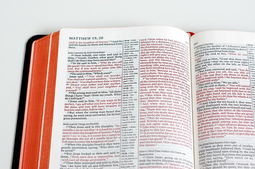
Above: The paper is opaque, the text clear and readable.
It bugs me, too. Some beautiful layouts -- the Standard NRSV from Harper Collins, an elegantly-proportioned single column setting -- are ruined by the terrible paper on which they're printed. And this seems to be more of a norm these days than an exception. Of course, Bible paper has always been thin, and has never been notorious for its opacity, but some of this stuff looks like wind would blow straight through it, that's how insubstantial it is. So the question becomes, how much can you put up with? And is "thin" really worth it if the price is less opacity?
Make no mistake, the Pitt Minion is thin. That's one of its selling points. But to my eyes, the paper seems quite good. Yes, you can see the impression on the reverse of the page, but it's faint, and not pronounced enough to be distracting. In fact, what I like about the Pitt Minion is that it seems to defy the odds in so many ways. It's limp when you'd expect stiffness, opaque when you'd expect the opposite, and readable when you'd think the type would be too small.
Because of course, small type is another way of achieving thinness, because it allows more words to be crowded on the page. But the NKJV layout doesn't seem crowded to the eye. As you can see, it's nicely balanced. The choice of font helps, too. (Both the NKJV and NIV are superior on this count, the KJV less so.)
Above: The mandatory 'yoga' photo. The goatskin is every bit as flexible as you'd expect.
SIZE AND COMPROMISE
In a lot of ways, the Pitt Minion gives conflicting impressions. When it's closed, it seems like a small Bible. When it's open, it doesn't. Typically, whenever I'm using a compact edition, I'm keenly aware of the trade-offs. This week, as I was chatting with a group of students at dinner, I had to look up a verse in the New Testament. I'd slipped a Compact ESV into my pocket earlier, so that's what I used. "Give me an extra minute here," I said, squinting at the tiny type, "I'm using a tiny Bible so it's going to take a bit longer."
With the Pitt Minion, that doesn't happen -- at least, not for me. The references are there, the text is readable, and the page size is taller and wider than most compact Bibles tend to be. In fact, if it weren't for the thinness, the Pitt Minion would feel more like a hand-sized Bible than a true compact.
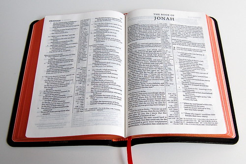
Above: Here, you can get a better idea of how much 'ghosting' -- or if you must, 'bleedthrough' -- the Pitt Minion has. It's present, but not distracting. Also, you can see that this is a full-featured reference Bible, completely lacking the stripped-down feel of some compact editions.
I think this is why the format is so popular. The Pitt Minion feels trim without coming off as compromised. They didn't strip out the power windows and the air conditioning just to get it to the desired weight. Instead, it's a full-featured edition in svelte package.
That doesn't mean it's for everyone. The Cambridge Pocket Cross-Reference NIV I reviewed early on in red Cabra bonded leather represents a different approach to the problem. It's not as tall as the Pitt Minion and not as wide, but it's noticeably thicker. Since it isn't marketed in the United States, most readers here are unfamiliar with the format. When I compare the two, I'm conflicted. I appreciate the smaller footprint of the Cross-Reference NIV, and don't mind the extra thickness, which only serves to fill the hand. But there's no denying the Pitt Minion's larger page size is an advantage, and its thinness coupled with the limp binding make handling it a real treat. If you don't like the slim profile, there are other options, but I have to say, it's really grown on me.
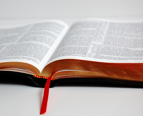
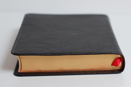
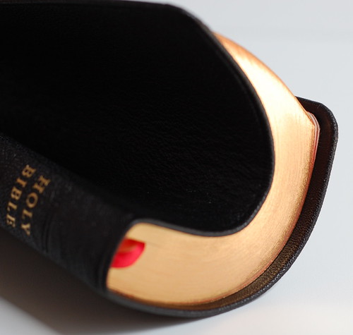
Above: The black goatskin binding comes with art-gilt edges and a single red ribbon. I'd prefer a minimum of two, three if I could get them.
Let's get down to specifics. If you visit the official Cambridge page for the NKJV Pitt Minion, you'll find the relevant numbers. The font is Lexicon, sized at 6.75/7 pt. (i.e., small), and the page size is 174 x 120 mm, which is 6.85 x 4.72 inches if you're wondering. (The Cross-Reference NIV, for comparison purposes, is 6 x 4.25 inches, set in 6/7 pt. Olympian.) It's a red letter setting, as you can see from the photos, with a concordance, references and maps.
It looks like the Cambridge strategy these days is to make popular translations available in the Pitt Minion format with an accompanying Pitt Minion wide margin. Both the NASB and NKJV are available in both formats (and only those, I believe), while the NIV is available in both formats and more. ESV editions of the Pitt Minion and wide margin are coming in a few months' time. Based on the examples I've seen, I'd say this is an excellent strategy to pursue. The Pitt Minion makes a great all-around Bible, while the wide margin is at the top of its class. It would be nice if a similar line were taken with other translations -- I'd love to see the NRSV and the REB in Pitt Minion trappings, for example.
Above: Here, I rolled up the Pitt Minion like a newspaper and held it in my fist. Sorry I couldn't get a better focus. But I think this illustrates just how supple the binding is.
You don't need me to tell you that the Pitt Minion is an impressive little Bible. Everybody's talking about them. If anything, I'm late to the game. Until I saw the goatskin editions, I took a "been there, done that" attitude toward the format, but now I'm anxiously awaiting the brown goatskin Pitt Minion ESV.
As you know, in the English-speaking world, we're spoiled for choices, both when it comes to translations and editions. In some ways, having so many choices makes it harder to just pick one. If you're looking for a versatile edition of the NKJV, well-suited to study, carry and worship, I think the Pitt Minion is one of the best you'll find.
Above: The sleek profile of the Pitt Minion makes it a pleasure to use.
J. Mark Bertrand is a novelist and pastor whose writing on Bible design has helped spark a publishing revolution. Mark is the author of Rethinking Worldview: Learning to Think, Live, and Speak in This World (Crossway, 2007), as well as the novels Back on Murder, Pattern of Wounds, and Nothing to Hide—described as a “series worth getting attached to” (Christianity Today) by “a major crime fiction talent” (Weekly Standard) in the vein of Michael Connelly, Ian Rankin, and Henning Mankell.
Mark has a BA in English Literature from Union University, an MFA in Creative Writing from the University of Houston, and an M.Div. from Heidelberg Theological Seminary. Through his influential Bible Design Blog, Mark has championed a new generation of readable Bibles. He is a founding member of the steering committee of the Society of Bible Craftsmanship, and chairs the Society’s Award Committee. His work was featured in the November 2021 issue of FaithLife’s Bible Study Magazine.
Mark also serves on the board of Worldview Academy, where he has been a member of the faculty of theology since 2003. Since 2017, he has been an ordained teaching elder in the Presbyterian Church in America. He and his wife Laurie life in Sioux Falls, South Dakota.