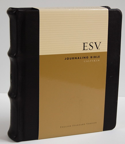
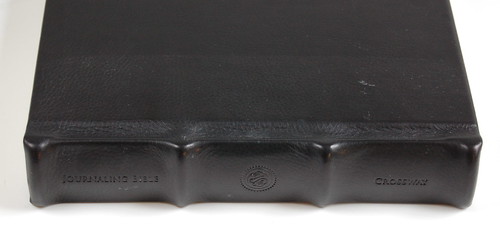
ESV Journaling Bible in Calfskin
If the National Security Administration's sophisticated anti-terrorism software could be calibrated to zero in on the phrase "I wish Crossway would do this," imagine how many e-mails, blog posts, and telephone calls would be intercepted. They'd have to hire extra staff. Considering how recent a translation the ESV is, it has a lot of fans. And some of us are, for lack of a better word, obsessive. We focus in on details most people would never notice. We are demanding. As a result, we tend to dwell on what's wrong and sometimes lose sight of what isn't. At any rate, I do. One thing Crossway has done a fantastic job of is offering its editions in a variety of covers. The original Classic Reference setting, for example, is now available in more than a dozen editions. There are over twenty thinline editions to choose from. You even get two options on metal-bound ESVs, choosing between the sleek refinement of "brushed aluminum" or the grungy authenticity of "weathered metal."
The Journaling Bible is no different. My money's always going to be on the original, Moleskine-inspired edition, which I've reviewed here. But if that doesn't float your boat, there are four other options to choose from -- a plum hardcover, a terracota/sage hardcover with elastic strap, a brown leather flap-and-strap cover, and the black calfskin featured here.
It took me awhile to realize just how magnificent the black calfskin hardback is, because I was blinded by the original edition. As I mentioned in my original review, the Moleskine-cover option emerged from an idea I pitched to Crossway several years ago. For the first -- and so far only -- time in my life, I brought a Bible idea to a publisher and, after putting some thought into it, they responded with a new product. My idea was to put an ESV New Testament, as is, inside a Moleskine cover, so I can't take credit for the whole Journaling Bible concept. Still, I wanted a Bible that looked like a Moleskine ... and got one.
So I didn't really warm to the other options at first. Why would you want a sage and terracotta hardback when there was a black one? Why would you want a wraparound leather flap? Moleskines don't have those, so why should you? When I was asked to suggest other cover options, I made a predictable suggestion: why not a red hardback with elastic strap, to mirror the new red Moleskines? Yes, I know. I'm a broken record.
So what happened to change my mind? A trip to the bookstore. Over the holidays, I found myself trolling around in section at Barnes & Noble dedicated to journals. Variety is the spice of life, and in spite of my crush on the little black notebooks, I found myself checking out the competition. There were a lot of interesting options out there. Lots of brown leather journals with wraparound flaps. Some black leather hardbacks with exaggerated raised bands. Where had I seen these options before? Oh, right. The Journaling Bible.
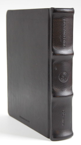
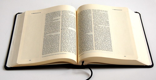
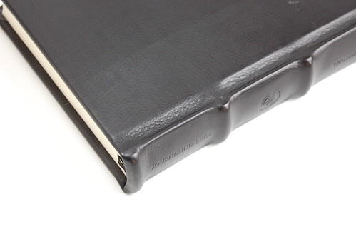
So I took a second look at the black calfskin hardback I'd had for about a year. I haven't taken very good care of it -- you can see a few dings in the leather from my carelessness. Think of it as a patina. I also goofed by storing it for awhile in the cardboard sleeve, which made a nice little line on the cover. But in spite of this, when I looked again at the black calf, I was really impressed. The spine is rather majestic, a bit like a Hollywood prop director's take on an ancient codex. Like the original Journaling Bible, it opens flat and features lined margins for note-taking. I even think the cream-colored pages work better with the leather than with the original. (Moleskines have white pages, after all.)
Now here's a little mystery for those of you who understanding binding better than I do. When I look at the spine, I see signatures and a layer of what I take to be glue. But I can separate individual signatures and pull them away from the spine until reaching an interior stitch. Like so:
Is the binding glued or sewn, or a hybrid of the two? I'm no expert, but I'd love to know.
If the Journaling Bible is your thing, but the Moleskine look isn't, this black calfskin hardback strikes me as an elegant alternative. It comes a premium, since this edition retails for more than twice than the original. But I have to say, as much as I like the original, in this case the extra money might just be worth it.
J. Mark Bertrand is a novelist and pastor whose writing on Bible design has helped spark a publishing revolution. Mark is the author of Rethinking Worldview: Learning to Think, Live, and Speak in This World (Crossway, 2007), as well as the novels Back on Murder, Pattern of Wounds, and Nothing to Hide—described as a “series worth getting attached to” (Christianity Today) by “a major crime fiction talent” (Weekly Standard) in the vein of Michael Connelly, Ian Rankin, and Henning Mankell.
Mark has a BA in English Literature from Union University, an MFA in Creative Writing from the University of Houston, and an M.Div. from Heidelberg Theological Seminary. Through his influential Bible Design Blog, Mark has championed a new generation of readable Bibles. He is a founding member of the steering committee of the Society of Bible Craftsmanship, and chairs the Society’s Award Committee. His work was featured in the November 2021 issue of FaithLife’s Bible Study Magazine.
Mark also serves on the board of Worldview Academy, where he has been a member of the faculty of theology since 2003. Since 2017, he has been an ordained teaching elder in the Presbyterian Church in America. He and his wife Laurie life in Sioux Falls, South Dakota.

